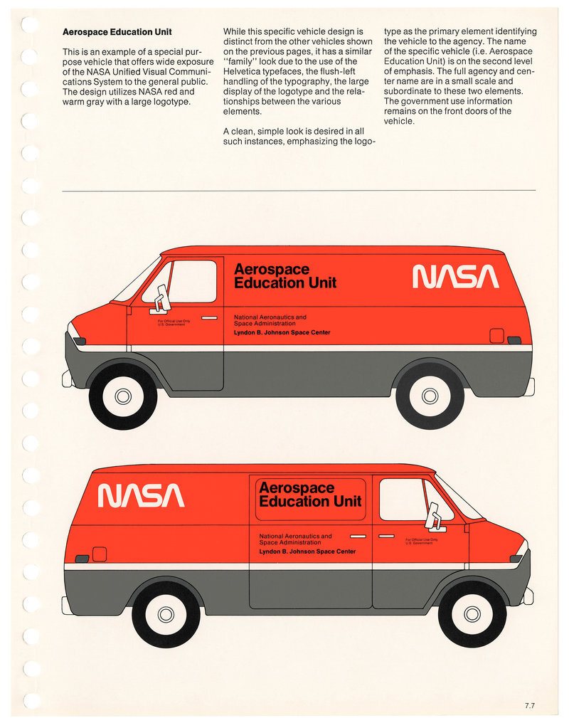
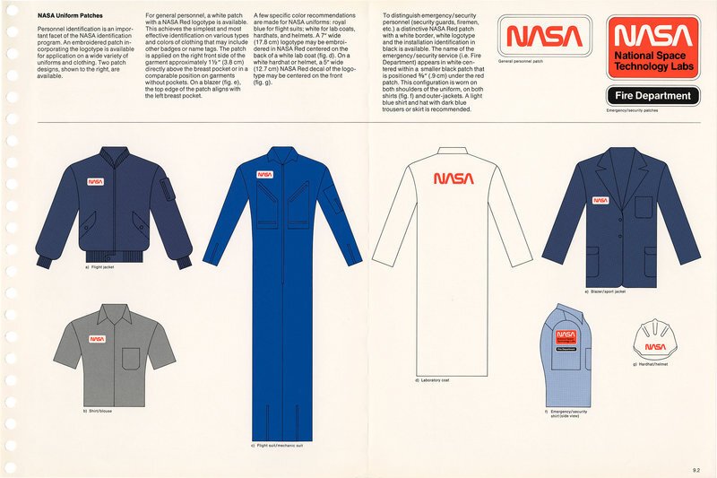
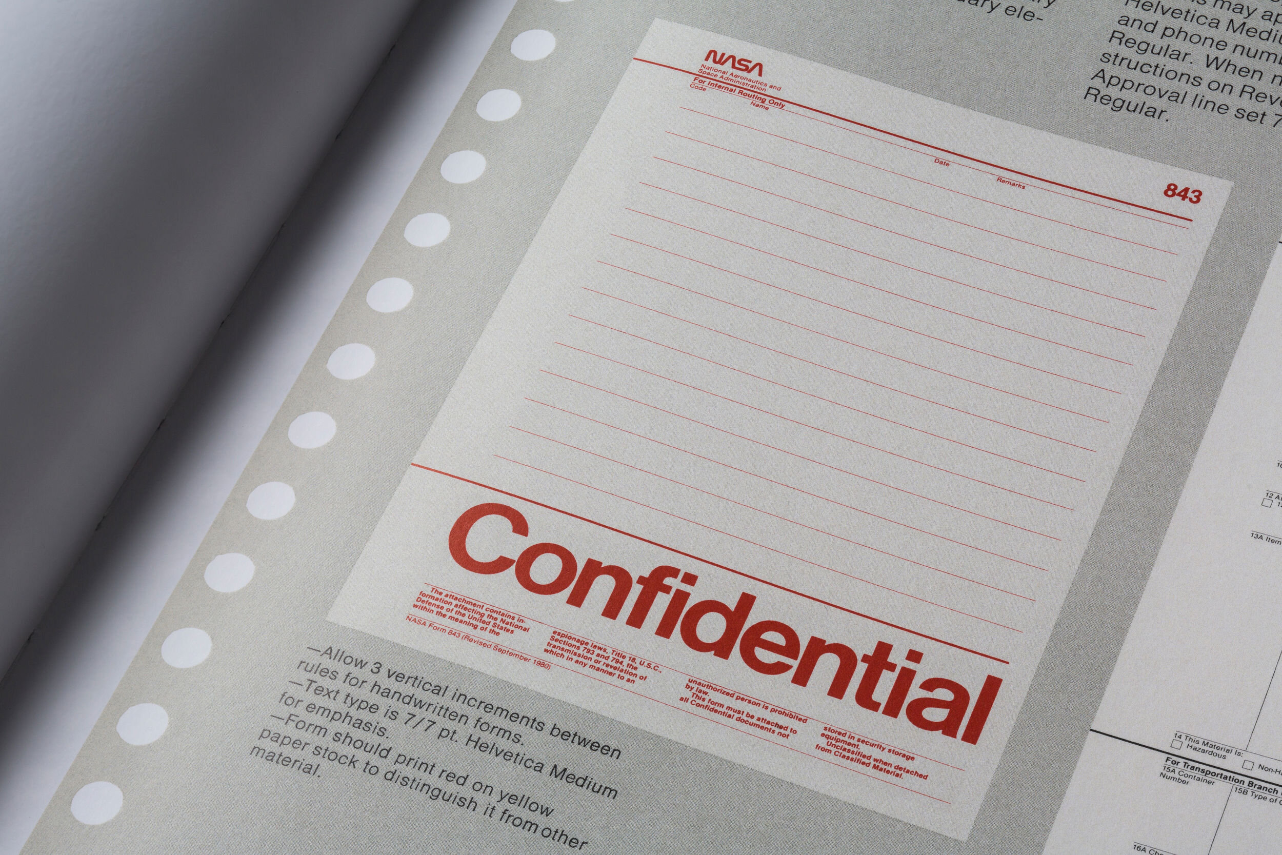
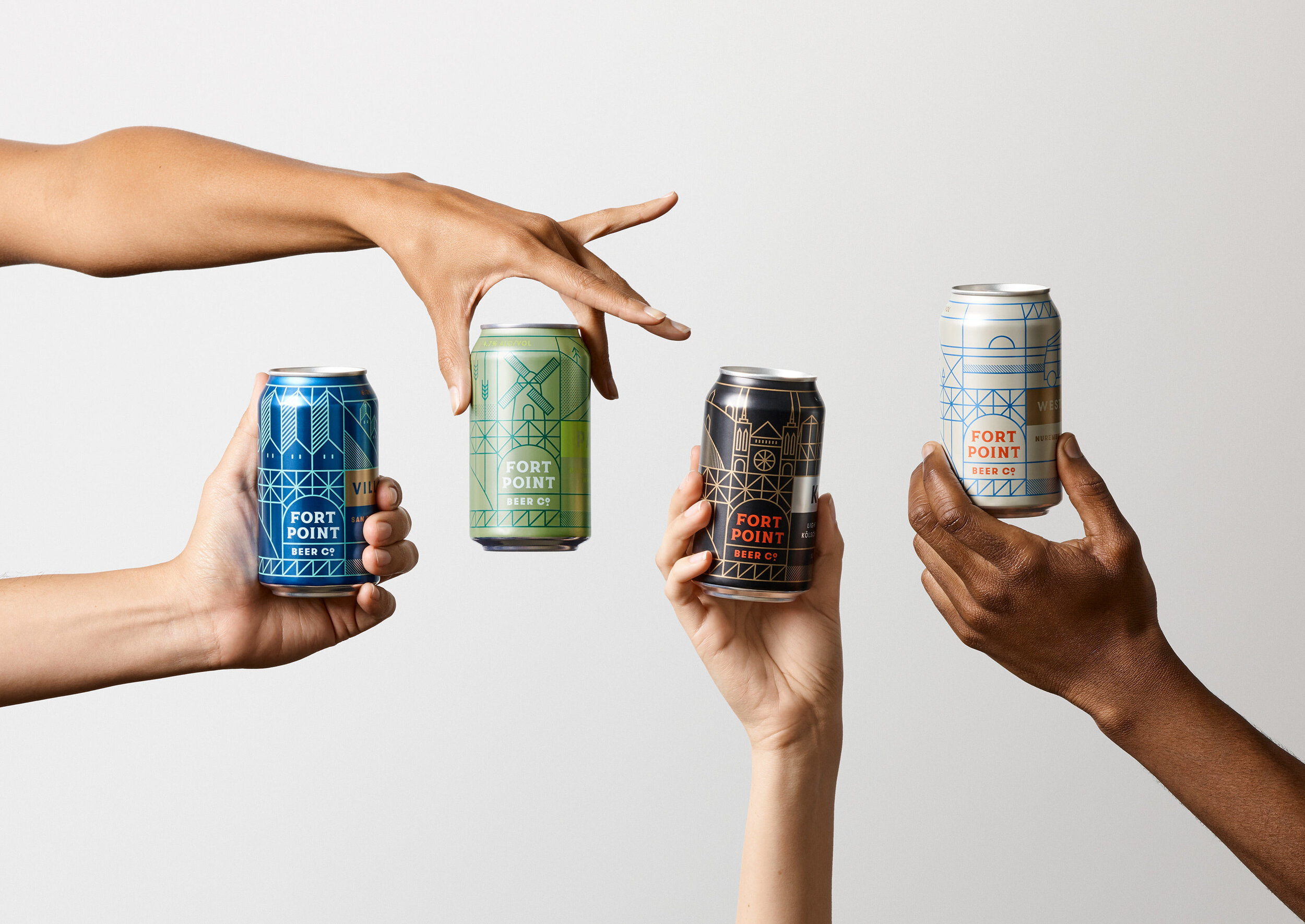
The Top Branding Trends of 2020 — & What to Expect in 2021 by Anastasia Salazar

2020 was, to put it lightly, a wild ride. In some ways, it seemed like the world began to move a little slower — no more rushing to the office in the mornings or cramming our schedules full of social engagements. In other ways, things moved at a breakneck pace. People and businesses alike had to adapt overnight to constantly-changing regulations and market shifts. And the world of branding certainly wasn’t exempt from this rapid change. The natural fluctuation in preferences that happens over time combined with the extraordinary events of the past year led to some seriously innovative and cool branding trends in 2020.

We’ve highlighted a few of the most notable ones below, as well as insight into how they might evolve over the year to come — read on to get some inspiration for your own brand.

2020 Branding Trends

Making Flat Designs Pop

In the past few years, many brands have favored flat designs without any dimension, shadows, or perspective. While it’s still possible to see strong examples, it’s becoming harder to keep the no-depth look fresh. Brands are starting to play with this trend more, though, as they incorporate new elements to add an additional level of complexity to their 2D design.

One example I’ve been seeing a lot of is 2D images with moving elements, like this Instagram post from artist and photographer Brooke DiDonato. It can be tough to get right, though. Brittany Spears’ “Swimming in the Stars” visualizer, for example, falls flat due to how busy it feels.

Another trend in adding depth to 2D design is mixing geometric patterns with textured and perspective design so that it feels more dynamic. Here’s an example from Dropbox.

dropbox-illustration-texture-geometric-patterns

Mixed Typefaces

In 2013, branding was awash with sans-serif typefaces, many of which were all-caps with a very condensed letterform (Bebas Neue seemed like it was everywhere). In later years, brands moved onto rounder sans-serif typefaces, like the new Google logo. Today, fonts like those are still popular, but brands are now mixing them with serif typefaces as well, especially in brand identities.

One brand that does a great job exemplifying this trend is Hims, a direct-to-consumer men’s health company. Their logo is a serif typeface, but all of their digital typeface is sans-serif — a good choice, since serifs can be hard to read in small print. That being said, I think their all-neutral palette could use some updating. Let’s get some color pops in there!

hims-website.png

To take serif fonts a step further, a lot of brands are using very thin stems and embellishments – something that will likely continue in the new year.

crane-serif-typeface-rebrand.png

Non-Design

In the age of digital media, content can be created and published instantly, and brands are taking advantage of that. With so many companies creating content, however, it’s no longer a differentiator. To stand out from their competitors, brands have to publish more and more content at an ever-increasing rate. Because of this, designers must work within a constantly shrinking timeframe, which can put a lot of constraints on the creative process. Paradoxically, though, these creative constraints can often result in innovation.

Many brands are now taking a low-effort design approach, where they leverage tools like emojis, gifs, Instagram Creator Studio, and templates to create quick and easy designs. Frequently, these designs are composed of simple shapes, limited colors, and just a few typefaces. 

Cove, a biodegradable water bottle company, is one example of a brand doing this look well. It’s super simple, but every element fits in and complements the others.

nondesign-cove.png

Retro Futurism

The design world always seems to be in love with the aesthetic from two decades before. Now that we’re in the 2020s, people have really begun to embrace the look of the 2000s — with a bit of a twist. Creatives are obsessed with nostalgia, but still dreaming of the future, which results in a unique retro-futuristic look that’s surreal and euphoric with lots of sparkle effects and glass type. This is especially present in digital media, like the example below from Fisk Projects.

2020-design-trends-evolution-branding-aluna-george

Some brands are kicking it back even further, like Kin Euphorics, which combines a 70s feel with a modern flair.

retrofuturism-2.png

The Natural Look

One silver lining of the COVID-19 pandemic is that it got people outside and helped inspire a renewed sense of appreciation for nature. A lot of brands seem to be acknowledging this with design that incorporates the outdoors and a more natural vibe. I’ve noticed this with a few recent commercials, such as this 90-second spot from Gucci or the More Nature campaign from Jeep.

I’m seeing more and more use of fuzzy and blurred imagery as well, which feels similarly organic.

the natural look.png

Source: Mary Herbert

Today’s brands are very aware of the world we’re all living in, and acknowledging it — and even finding some beauty in it — allows them to connect with their audiences on a more personal level. Although a vaccine is on the horizon, it will probably be a while before we return to normal, so I don’t see this trend ending anytime soon. 

Experiential Design

In a year where indoor gatherings are off-limits, a lot of companies found creative ways to reenact experiences in a digital format. And this wasn’t just limited to event-based businesses. Hulu came out with an awesome haunted house simulator called the Screamlands around Halloween (or, as they called it, Huluween).

experiential-design.png

Another experiential area more brands are leveraging is virtual reality (VR) and augmented reality (AR). Even the fashion world is adopting these technologies, with luxury brand Balenciaga recently announcing that their fall 2021 collection will debut in VR using avatars as models. AR is also taking off in popularity thanks to platforms like Spark AR studio for Instagram that make it more accessible. It’s bringing a lot of fun weirdness back to branding — check out this AR crossword puzzle filter The New York Times recently released.

As audiences become more comfortable with interactive experiences on websites and social media, my prediction is that brands will begin carrying it over to their native apps soon as well. 

Playfulness

If there’s one thing we could use more of right now, it’s levity. Thankfully, companies all across the board have been stepping up to the plate. Brands seem to have loosened up a little bit on their guidelines, giving them the flexibility they need to succeed on more casual channels like social media. As a designer, this is exciting, because it allows you to play with a brand in all its different forms and craft a slightly tailored visual language for each.

In addition to brand design, this is also happening in brand messaging. Companies are embracing a more down-to-earth tone of voice, sometimes successfully (Dollar Shave Club does a great job of being casual, clear, and often entertaining) and sometimes not (Cosmopolitan tries a little too hard with all the slang and abbreviations).

This playfulness has even extended to data visualizations. Companies are going beyond bar graphs in brand colors to display data in interesting and unique ways, like this piece from creative studio Datalands.

datalands-playfulness.png

Of course, these branding trends may not all be right for you — it’s much more important to embrace authenticity than whatever’s in the zeitgeist. But if you can figure out how to incorporate one or more in a way that feels true to your brand, you’ll be ahead of the curve in 2021.

Anastasia Salazar Ltd. is an independent design studio for tailored branding and digital designs. Reach out to learn how we can help you fuel growth and maximize your brand’s impact.

30+ Business Swag Ideas That Make Awesome Gifts by Anastasia Salazar

business-swag-holiday-gift-anastasia-salazar-design-blog-header

We've all left a conference or event drowning in useless corporate swag like fidget spinners or keychains, or things we already have too many of, like pens and cheap water bottles. 

But business swag doesn't have to be something your prospects, clients, and employees throw in the junk drawer and never look at again. 

When done right, merch can be fun, clever, and meaningful — making it the perfect choice for a gift and a fantastic way for prospective clients to remember your business. 

If you're not sure which branded merch to go for, we've put together a guide to the best business swag ideas. From tote bags to temporary tattoos, you'll be spoilt for choice!

What makes great business swag?

Before we dive into specific business swag ideas, let's go over a few basic principles. Swag should always be:

Useful

Is anyone really going to use a mini frisbee or a pair of cheap sunglasses more than once? Probably not. 

Novelties like toys get old fast, and if you're going to wear sunglasses, you'll probably want to choose your own style. 

When considering swag options, try to choose something that people can use over and over.

Thoughtful

You don't want your swag to come across as a last-minute afterthought.

A well-thought-out piece of merch shows clients and employees that you have their best interests at heart.

Think of how you can tailor your business swag specifically to your company. If you're creating a gift for employees, for example, you could incorporate some inside jokes or references into the design.

You can also choose an item that relates to your company in some way. For example, if you work in the travel sector, you could opt for a luggage tag that doubles as a phone charger for when people go on vacation.

If you work in IT, USB drives and webcam covers are functional options everyone can use.

Seasonal

Certain merch ideas work best at different times of the year.

For example, an ice scraper may go down well in the cold and chilly winter months but won't be as well-received in the summer.

Specific events can also inspire merchandise ideas. During the Olympics, sports-related business swag like beachballs and fitness towels were popular options!

I always recommend planning ahead for the best results — identify when you need your business swag and know what your recipients want to see.

High-quality

Your corporate swag doesn't need to be made of luxury materials, but it should be well-made: no loose threads, tears or jagged plastic seams.

Most manufacturers will be happy to send you a sample so you can check the quality before you commit.

Once, I was helping a client send out customized candles, and I received a sample from a manufacturer that left a smoke mark on my wall — needless to say, we didn't move forward with them!

Subtle

I've been gifted some swag over the years that would have been great… if it didn't have a gigantic logo plastered on it. 

As much as you want to showcase your brand, people are often hesitant to wear clothing or use an item that's so conspicuously branded. Nobody wants to feel like a walking advertisement.

Less is more when it comes to business swag — keep your logo small and focus on the placement.

Business swag ideas your clients will love

When it comes to business swag, there's something for every business, every customer, and every budget. It's just a case of knowing what to choose!

If you're stuck for inspiration, here are some great ideas.

Easy logo solutions

If you want something affordable and easy to create, these branded merch ideas are great starting points. Just add your logo, pick your brand colors, and you're ready to go!

(Make sure to send the vendors a file with print versions of your logo. Ask if they can do a Pantone match to find the exact brand color — CMYK outcomes can vary widely in quality.)

  • Webcam covers for laptops

  • Mints

  • Door opener: These let you open push, pull, or turnstile doors without touching them. They exploded in popularity during the pandemic and are still popular today!

  • Hand sanitizer

  • Thumbdrives/USB flash drives

  • Water Bottles: Only offer a water bottle if it's a keeper like this — people usually have more than enough flimsy plastic or metallic-tasting water bottles at home

  • Portable chargers

  • Pencils/pens

  • Blanket

  • Picnic blanket

  • Jackets/sweaters/hoodies: Again, these are only worth making if they're high-quality — A quarter zip is always a good choice

  • Notebook

  • Car phone mount

  • Tile Mates: These are small trackers you can attach to your wallet, key ring or laptop and locate with your smartphone

Creative solutions

If you're game for some more design-intensive business swag ideas, these items are perfect for helping you creatively express your brand.

  • Art prints

  • Tote bags: Choose a cool illustration or playful typography to make a tote bag that stands out from the rest

business-swag-holiday-gift-tote-bag-1
business-swag-holiday-gift-tote-bag-2
  • Pop socket: These are cool if you choose the right design — maybe something eccentric or fun like a donut or an inside reference to your company culture

  • Iron-on patches

  • Stickers: Do a whole sheet of stickers with different designs to show off the playful side of your brand — here are a few we designed for our client Hot&Heavy

business-swag-holiday-gift-stickers-1
  • Shot glasses: One of the more memorable pieces of swag I got in recent years was a shot glass along with a two-page brochure of cocktail recipes. If you go this route, make sure to include a few mocktails on there so those who don't drink feel included too

  • Custom socks: As a kid, getting a pair of socks for a gift was a let-down — but as an adult, it rocks! Plus, you can make them a little more funky and out there since they're mostly covered up throughout the day. Try experimenting with fun patterns and colors! 

  1. Pins: I worked with one of my clients to do a whole set of pins to give out on employee anniversaries. We went with a varsity theme since they would greet new employees with "Welcome to Varsity." We included some other insider references, too, like the high five design — a nod to how their CEO gave out high fives at every all-hands meeting.

business-swag-holiday-gift-lapel-pins-1
  • Kids’ merch: Getting clothes for employees can be tricky because everybody has their own personal taste, but kids tend to be less picky. Plus, they’ll look cute in just about any merch you design.

business-swag-holiday-gift-kids-clothing-t-shirt
  • Matches or lighters: These won’t be a good fit for every company, but they’re perfect for restaurants, bars, and hotels.

business-swag-holiday-gift-matches-restaurant
  • Branded wrapping paper: To go the extra mile, you can wrap your gifts in branded tissue paper or wrapping paper — swag on swag!

Environmentally-friendly ideas

Some brands refuse to offer business swag because they don't want it going to landfill. 

The great news is that there are now lots of fantastic options that are long-lasting, eco-friendly, and show your sustainable credentials.

  • Reusable straw: I love the collapsible ones that you can fit into a keychain to carry around with you

  • Desktop garden kits: Plant the seeds in the pot, water them, and wait for them to grow. These are great for bringing a pop of greenery into the office

  • Beeswax wraps: A sustainable alternative to plastic wrap, these are reusable and fully compostable

Corporate swag bags

For big moments or events, combining a few items together in a kit can make your customers and employees feel like VIPs.

  • Welcome kit: Some businesses show their appreciation for new employees or clients by putting together a bundle that helps them get to know the company better. When I joined the Wing's co-working space, I got a flight-themed welcome kit with a flight manual (information packet), passport ticket (guide to the neighborhood), coupons, welcome letter, and notepad. It was a really nice touch that made me excited to be a member

  • Conference kits: Swag bags are a must-have at conferences today. There's a vendor I love that offers a customizable swag-in-a-box package. You can choose from things like mints, hand sanitizer, pens, notebooks, water bottles, bags… just choose your elements, and they'll put a pack together

  • Travel kits: One of my favorite kits I've worked on was for a hotel chain called StayCity back in 2015. They offered a whole travel kit with branded eye masks, door tags, snacks, and coffee cups, each with a slogan like "stay rested," “stay fed,” “stay awake”. It was so unique and valuable

business-swag-holiday-gift-kit-1
business-swag-holiday-gift-kit-2-travel
business-swag-holiday-gift-kit-3-travel

How to choose the perfect vendor

Once you’ve decided what kind of business swag you want to give out, it’s time to choose a vendor that can deliver the goods. Here are a few tips for finding the right one:

Go local

I try to choose a local vendor whenever I can for a few different reasons. It’s more eco-friendly, you’ll get responses within your own time zone, and you can see a proof first to make sure it’s what you wanted.

This is especially important if you have a rarer brand color or specialized design request. Some vendors will mail you a sample if you don’t live nearby, but it takes longer than stopping by in person.

If you’re in the San Francisco Bay Area, a few vendors that I’ve had a great experience with are Camputee Press, Free Gold Watch, and Colpa Press.

Check their own branding

I always look for vendors that have good branding in terms of their logo, website and marketing materials. This shows that they’re passionate about design and pay attention to detail.

It’s always reassuring to work with an established vendor, so look up how long they’ve been around and what their customers say.

Ask questions

Don’t be afraid to ask questions. A good vendor will be happy to answer them.

Also don’t hesitate to ask for their opinion. Your vendor of choice may offer recommendations you might not have considered, or be able to spot potential issues you might not have thought of.

Substandard materials, unimaginative designs, and gaudy logos have given business swag a bad rap over the years. 

However, a lot of vendors have stepped their game up since then, and if you’re willing to put in the time, effort, and resources, you can definitely create gift-worthy products. 

Whether you go with one of the business swag ideas above or one of your own, a little thoughtfulness and creativity will go a long way towards providing an exceptional experience for your prospects, clients, and employees.

Anastasia Salazar Ltd. is an independent design studio for tailored branding and digital designs. Reach out to learn how we can help you fuel growth and maximize your brand’s impact.
5 Holiday Marketing Ideas to Inspire You This Season by Anastasia Salazar

ASL_Design-Blog-Holiday-Marketing-Ideas_v1_Website.png

With the holiday season just around the corner, companies everywhere are gearing up their marketing efforts. But in an increasingly competitive landscape, it’s not enough to just offer discounts or sales anymore. Today’s most cutting-edge companies are embracing original and inventive holiday marketing ideas to meaningfully connect with their target audience during the most wonderful time of the year. If you’re looking for some inspiration to help your brand stand out this holiday season, check out the cool marketing examples we’ve rounded up below.

Top Holiday Marketing Ideas

Holiday Cards

Cards are a traditional staple of holiday marketing, but that doesn’t mean they can’t be fresh or fun — there are tons of different ways to play with the content and the format to create something clever and memorable. Whether you choose to do something classic or innovative, heartfelt or playful, modern or retro, it’s a perfect opportunity to express your brand.

5-holiday-marketing-ideas-to-inspire-creative-card.jpg

One holiday card I really enjoyed working on a few years back was for my client Anaplan, a company that makes cloud-based planning software. They wanted a card that could be sent to employees as well as clients both in print and digitally. Since Anaplan is a global company, they would have to translate it into a few different languages, meaning my team and I couldn’t use any decorative lettering. We ended up choosing a mixed media design that incorporated a handcrafted element. We got a big foam board, cut out a bunch of holes, and stuck in Christmas lights in the shape of their logo. We knew that image would work well for printed cards, but we also thought it could be fun to make it into a gif for digital applications — so we did a photoshoot of the logo with the lights turned both on and off, creating an animated gif with flashing light bulbs. The end result was a cool, unique card with a personalized feel due to its handmade touches.

It’s worth mentioning, though, that a holiday card doesn’t always have to be a card in the traditional sense. This example from creative agency Red & Co. — a wine bottle with a “drunken love letter” on the label, customized for each of their clients — is one of the best holiday marketing ideas I’ve seen. Mira Kaddoura, Red & Co. founder and executive creative director, explained: "This industry can be hard on us and our clients, so we thought a funny, cheerful, (pretend) drunken holiday card would make our clients laugh a little and remind them of what we’ve been able to do together."

5-holiday-marketing-ideas-to-inspire-creative-card-2.jpg

You could even do a hologram like the image seen below. I know it looks intimidating, but holograms are actually surprisingly easy to make. They’re really inexpensive, too — all you need is a projector.

ASL-5-holiday-marketing-ideas-to-inspire-creative-hologram.jpg

Ad Campaigns

Today, it seems like nearly every company does a campaign around the holidays. This does make it a bit more of a challenge to grab people’s attention, but it doesn’t mean it’s not worth pursuing — it just means you need to make yours stand out.

One of the more memorable holiday marketing campaigns I worked on in the last few years was a Black Friday campaign for Udemy, an online learning platform. This stuck out for a couple of reasons, one of which was the “shop smart” concept the campaign touted. Over the years, retailers have struggled with the fact that today’s consumers are more hesitant to buy physical goods. People are choosing to simplify rather than load up on items that will sit around in their closet or garage untouched. We decided to capitalize on that trend for this campaign — instead of buying some shiny new toy you’ll never use, why not invest in your skill set and your career? Udemy offered a special of $10 courses throughout the whole week, targeted toward career-minded individuals hoping to climb the corporate ladder as well as businesses interested in employee professional development. 

ASL-5-holiday-marketing-ideas-to-inspire-creative-campaign-udemy.jpg
ASL-5-holiday-marketing-ideas-to-inspire-creative-campaign-2-udemy.jpg

Another thing that set this campaign apart was the use of bright colors. Just about every other company with a Black Friday campaign used a black color scheme to play off of the name, so these colorful ads really stood out in comparison. We chose colors and typography that reflected Udemy’s brand, and the 3D gravity free objects we featured were universal enough that they worked for all of the different courses the company offered and segments they targeted.

Microsites

Since the onset of the COVID-19 pandemic, the number of people working from their offices has drastically decreased. For B2B companies that like to send their clients and prospects physical pieces, this has posed a special challenge. The good news? There are other holiday marketing ideas that work just as well. Microsites, for example, are a fun and flexible digital option — plus, they can provide you with a ton of valuable data.

One of the best examples of a holiday-themed microsite I’ve seen comes from Emotive Brand, a brand strategy and design agency I’ve worked with in the past. They created an interactive A-Z dictionary of emotions for brands who might need help “unwrapping” their feelings. Every time you mouse over a word, you trigger a little representative animation. You can click on each word to get a definition of it as well as a quote featuring it. At the end, they have a few paragraphs explaining the concept behind it:

“These 50 feelings are a selection from 301 emotions we use to help our clients build successful brands. For each entry, we have paired graphic design and animation with quotes from our team and influential thinkers. The result is a visual metaphor that aims to not only illustrate the emotion, but bring it to life.”

It’s an amazing way to drive home the unique value proposition that the agency offers, and such a creative idea. If you decide to create a microsite, remember that it doesn’t have to be some cookie cutter landing page for a holiday deal — a playful, unique direction will be way more engaging.

Social Media

Social media is one of the best holiday marketing ideas because it’s so accessible. Everyone from small mom-and-pop shops to big corporations can put together a few fun social posts, regardless of their budget. And because social media is a more casual platform, brands can really let their hair down in a way that humanizes them. It’s the perfect place to post something cute or cheeky that appeals to the digital age. 

Holiday social media posts lend themselves well to video — I’ve seen companies share recordings of employees lip-syncing to Christmas carols, funny skits, stop-motion animations, etc. One super easy, low-budget way to leverage video is a holiday ecard from JibJab. Just upload a few photos of your team and you can bring them to life with themes like holiday disco, snowball fight, or office party. And speaking of team photos, another cute option could be sharing pictures of your different team members celebrating the holidays as children.

Whatever you end up choosing, don’t be afraid to have some fun with it. Social media is a channel where audiences respond well to brands embracing their playful side.

Gifts

Of course, you can’t talk about the holidays without mentioning gifts. Sending customers/clients or prospects some branded company swag — as long as it’s useful — can be a thoughtful way to thank them for their support and remind them of what you have to offer.

Anastasia-Salazar-2021-calendar-risograph-holiday-marketing-ideas-to-inspire.png

This year, we created a calendar. It’s a great way to show off what we can do in terms of design, but also a useful gift — just about everyone can use a calendar. And I don’t know about you, but after what a mess 2020 has been, 2021 can’t come quickly enough! We went with a bright, lively design to evoke a cheerful and uplifting mood, and decided to risograph it because this type of printing creates such fun colors, textures, and overlays. 

There are tons of other options for cool holiday gifts. The image below, for example, is a gift from Austin-based ad agency GSD&M. GSD&M decided to go beyond the typical holiday gift for something more buzzworthy — literally. The agency sent its clients and partners jars of pure honey, collected from bees it has been hosting on its own rooftop. Everything from the jars to the labels, fonts, colors, embossed note and even the honey-inspired recipes inside were hand-selected and created in-house. Keep an eye out for even more company swag gift ideas in our next blog post!

ASL-5-holiday-marketing-ideas-to-inspire-gifts.jpg

For many companies, the holiday season is the most critical period of the year. While it can be tough to attract your audience’s attention amidst shopping, travel, and a deluge of marketing efforts from other brands, you’re also presented with an amazing opportunity to get creative and take risks that you might not normally. Hopefully, these holiday marketing ideas will inspire you to pull off something truly special. And if that happens, you won’t just capture your audience’s interest for a month or two — you’ll stick out in their minds for the entire year.

Anastasia Salazar Ltd. is an independent design studio for tailored branding and digital designs. Reach out to learn how we can help you fuel growth and maximize your brand’s impact.

How to Kick Off a Rebrand or Brand Refresh by Anastasia Salazar

ASL_Design-Blog-Rebrand-Next-Steps_v1_Website.png

In our last blog post, we shared a quiz to help you figure out whether it was time to modernize your brand. If you realized your brand was overdue for an update, you might be wondering: What comes next? A rebrand or brand refresh is a big project, and it can be challenging to figure out where to begin — especially if you’ve never done one before. So to help you start off on the right foot, we’re going to discuss exactly which steps you should take after deciding your brand could use a revamp.

Rebrand or Brand Refresh Next Steps

Create an Audit

Although branding agencies will often guide you through the creation of an audit as part of a brand refresh or rebranding, getting a head start on one beforehand can provide you with valuable initial direction on your project as well as help you gain internal buy-in (more on that later). It may also save you money when it does come time to hire an agency by allowing you to narrow the project scope, making it an especially attractive option for smaller or budget-constrained companies.

The audit should focus on where the gaps are in your brand and how they could be improved. Make sure to use data — such as market research and customer interviews — to back up your findings and recommendations whenever you can. Here are a few elements in particular that you might want to include in your audit:

  • Purpose: Having a “why” behind your business is critical to growth and success. If you don’t have a clear one at the moment or aren’t in agreement across your organization, you’re missing out on a huge opportunity to align your team and motivate them to do their best work.

  • Narrative: Similar to your brand purpose, your brand narrative describes who your organization is and what you stand for. It may include your history, promise to customers, or your perspective.

  • Positioning: Positioning is all about how your brand is represented — is your brand enforcing the right message? Is it helping the company grow? Do you think it should change in any way? Key to answering these questions is a thorough, data-backed understanding of who your target audience is. Otherwise, your strategy may be entirely off-base.

  • Brand Architecture: Many companies have more than just one core product or service. While it’s important to keep your brand largely consistent, you may want to alter it slightly for certain product lines or services in order to differentiate them from one another. A brand architecture is a visual hierarchy that helps you organize all of these variations of your branding and ensure that they all work well together. 

  • Competition: First, identify the brand category you fit into (e.g. data analytics platform, eCommerce clothing retailer, fast-casual restaurant). This may have changed over time,  and given how critical it is to your audience’s understanding of your company, you’ll need to check in on it every once in a while. Then, list all of the other companies that you compete against within that category, paying close attention to the strengths and weaknesses of their respective brands.

  • Creative Assets: Creative assets are the most tangible representation of your brand, and often take the form of templates for different use cases — digital banner ads, social media cover photos, logo lock-ups for your homepage. Take stock of which creative assets you currently have and which ones you’ll need in the future.

  • Find more ideas here

As you gather this information, take note of how much of a disconnect there is between where your brand is now and where you want it to be. If the difference is drastic, you may want to go all out and pursue a rebrand. If you’re within range of where you want to be, though, it may only take a brand refresh to help you reach your goals.

Make Your Case

ASL_Design-Blog-Rebrand-Next-Steps-make-your-case.jpg

In order to go through with a rebrand or brand refresh, you’ll need approval from your larger organization, including your leadership team. This can sometimes be a challenge, as results-driven business leaders don’t always see the immediate value of a strong brand. But if you’ve put together a thoughtful and thorough brand audit, your job will be much easier. Here are a few tips for presenting your audit and persuading your audience: 

  • Explain what a brand does and how it impacts you: It can be hard to define what exactly a brand is, but describing what it does is much simpler. Discuss how a strong brand can lead to better ROI, a more aligned team, higher employee engagement, and consumer affinity. To support this, try researching how rebranding or brand refreshes have helped other companies in your sector, or draw on your own experience. Share a time when a new or updated design led to improved business results, like an ad campaign or social media revamp. Remember: The more you can concretely cite how a brand update would benefit you, the more likely it is that you’ll get the go-ahead.

  • Focus on what’s most useful for your company: Design needs vary significantly from organization to organization, so highlight the specific ways in which revamping your brand would be beneficial for your company in particular. At Google Play, for example, we did a ton of promotions for mobile gaming. When I was pushing for a refresh, I pointed to the market research we had gathered on our different customers’ wants and needs, then connected that to specific visual examples in our collateral that were misaligned with their feedback.

  • Do an alignment exercise: This is a good strategy for getting a team that is new or hesitant to branding updates on board. By surveying different members of your organization on their understanding of the brand, you can highlight any misalignments to those who feel the brand is fine as it is. You can ask questions like “what’s our competitive advantage,” “which three adjectives would you use to describe us,” and “how does our audience see us?” If you’re in need of a rebrand or brand refresh, the answers will likely vary. Share those results with senior leadership for a quick and easy way to demonstrate that you’re not fully aligned and, as a result, struggling to move forward.

Envision Your Future

Once you get the green light to update your brand, it’s time for the fun part — envisioning how that might look. There’s no limit to the number of directions you could go in, but before you commit to one, I recommend trying a couple of exercises for guidance:

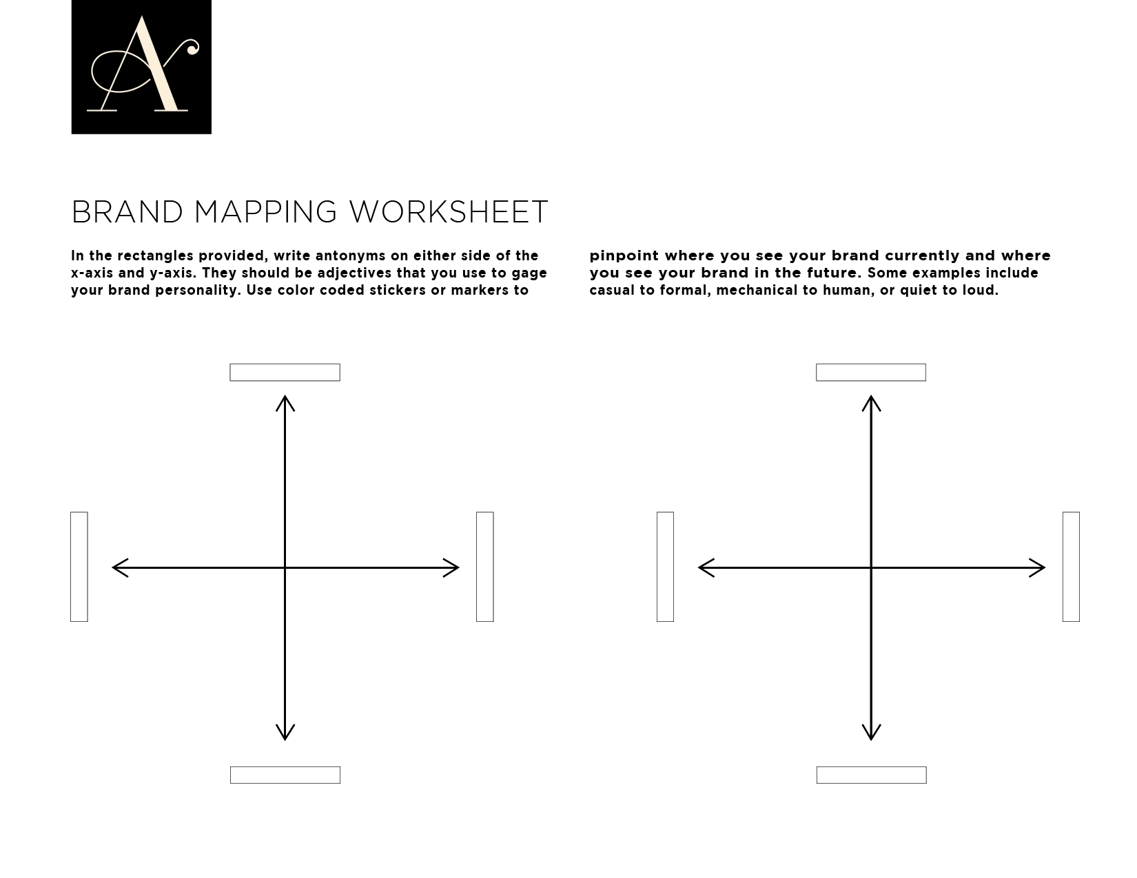
  • Brand mapping: Brand mapping exercises are perfect for helping you figure out which traits you want your brand to embody, and our brand mapping worksheet is a great one to start out with. This worksheet contains an assortment of scales for different brand attributes — mechanical to human, quiet to loud, casual to formal, to name just a few — and allows you to use stickers to pinpoint where you fall on that scale now and where you want to in the future. It can also be helpful to add your competitors to the chart so that you can think about how to best stand out from the crowd.

  • Mood boards: Put together a presentation with examples of brands and design that inspire you and try to identify the elements you think could work for your company’s brand.

A quick note — it’s important to find balance between authenticity and aspiration when modernizing your brand. You’ll want a design that reflects your organization, but ups the ante. If you choose something too similar to your current branding, it might not feel different enough to your customers and employees. On the other hand, be careful about choosing something drastically different than who you are. A tax firm, for example, probably shouldn’t try to emulate the whimsical branding of a trendy beauty product company.

If you’re ever unsure about whether your desired branding authentically reflects you, don't be afraid to reach out to employees, customers, and design professionals for feedback.

Look Around You

Design is a crowded space. If you really want to stand out from others, you’ll need to search far and wide for inspiration. Design blogs are a good place to start. I like AIGA’s Eye on Design and siteInspire for websites. Thumbing through design books works well, too. Fortunately, almost every major city has a cool art bookstore (in San Francisco, I like William Stout Architectural Books). If you want to dig deep, you can even attend design conferences or festivals.

I also suggest just keeping an eye out for the design you encounter in your daily life. If you come across an ad for a brand with a great social media presence, for example, like the post so that more of their content appears in your timeline. If you see an ad that you like on the metro, snap a picture of it with your phone. Museums are another excellent source for inspo — head to one with a notebook and pen, and jot down which pieces speak to you. All of this will help you generate ideas when it comes time to pick a particular design direction.

Find the Right Partner

With a project as big as rebranding or a brand refresh, you’re almost certainly going to want to work with an agency rather than just relying on your in-house team. Before you identify specific agencies, though, make sure to think about your budget, timeline, and goals. You should also identify which assets are the most important for you, whether it’s a new presentation template or branded whitepapers. 

Next, it’ll be time to start your agency search (read here for a few tips on how to do that). Create an agency shortlist, and reach out to them to learn more about their approach, find out the cost, and provide some context around your project. Even early on, you should be able to tell if their work aligns with your visual preferences.

Branding isn’t just a one-off investment — it’s a continually ongoing process. And if you want your brand to stand the test of time like Apple, Nike, and Google, you’ll need to update and modernize it from time to time. The good news? If you’ve got a strong foundation, a strong brand can make you virtually unstoppable.

Anastasia Salazar Ltd. is an independent design studio for tailored branding and digital designs. Reach out to learn how we can help you fuel growth and maximize your brand’s impact.

Quiz: Is It Time for a Brand Refresh? by Anastasia Salazar

ASL-Design-Blog-Time-for-rebrand-brand-identity-2

As easy as it would be to create an amazing brand identity and never have to update it again, it’s just not realistic. If you don’t refresh your brand every so often, you risk becoming outdated and irrelevant — which will make building a relationship with your audience and attracting new customers that much harder. Of course, the branding process takes a lot of time and effort, and it’s not realistic to update your brand with every new trend that emerges. So how do you know when it’s time for a brand refresh? We’ve put together a quiz to help you answer that question — check it out below!

Brand Refresh Quiz

1. How long has it been since you last updated your brand identity?

A) Less than a year

B) 1-2 years

C) 3-5 years or more

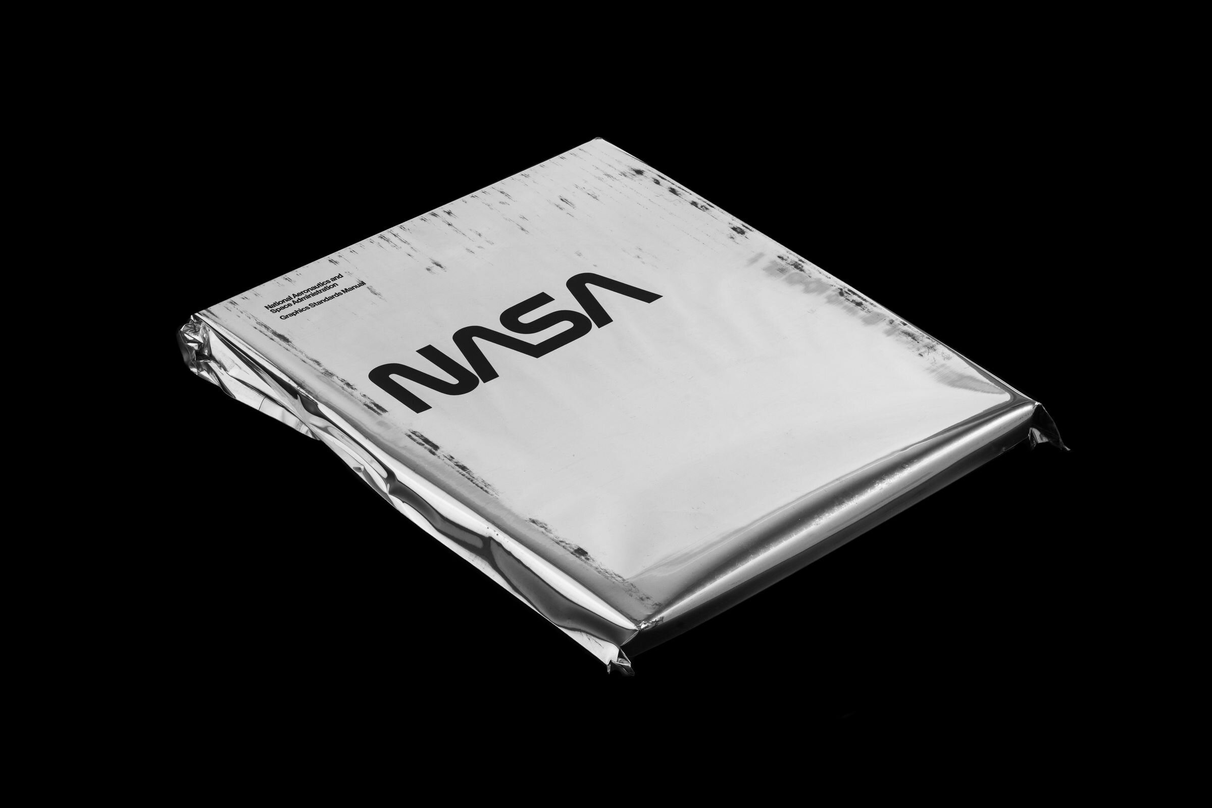
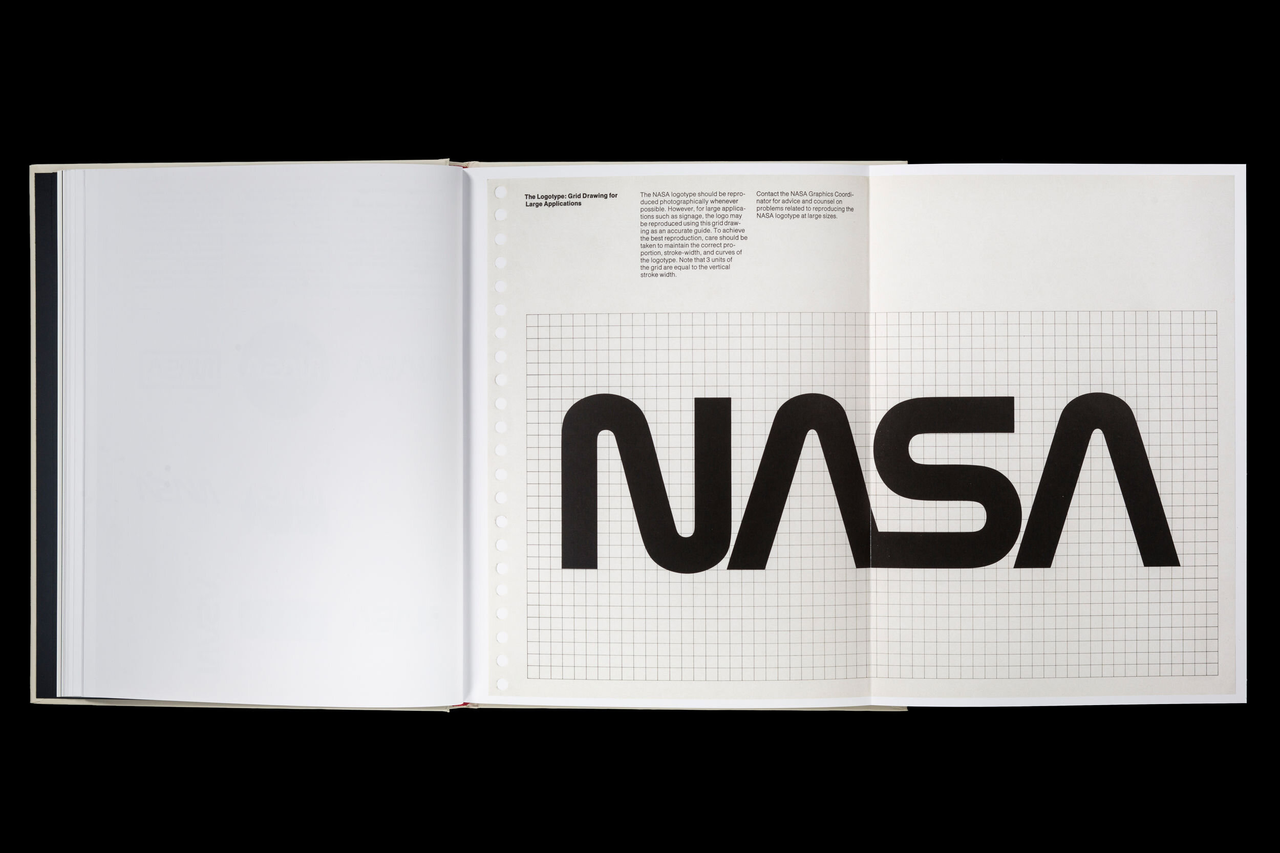
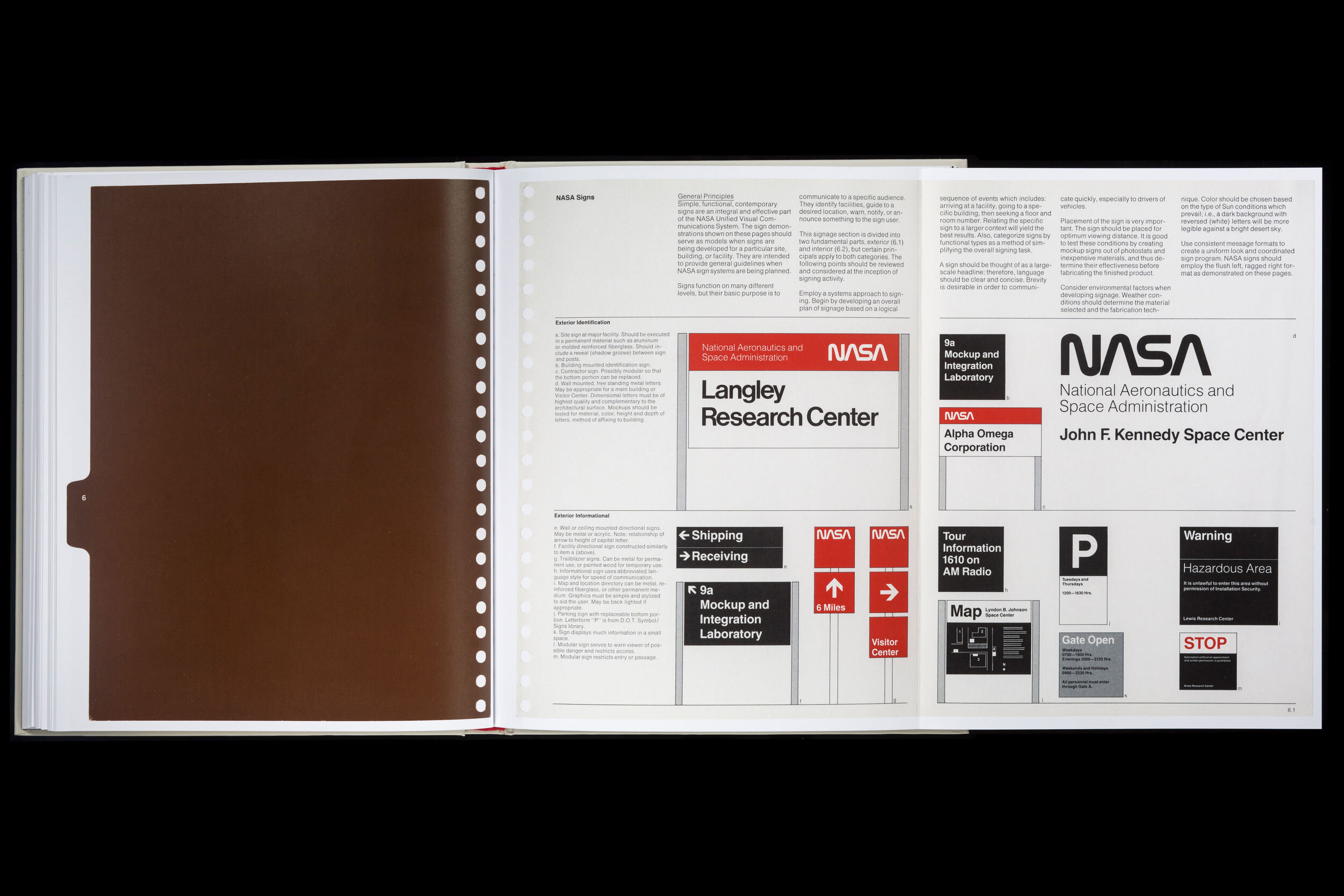
The old saying that nothing lasts forever definitely holds true in the fast-moving world of design. Visual preferences usually don’t transform completely within a year, but they do always vary slightly — and those small changes add up over time. After about three to five years, you’ll probably find that your initial branding starts to feel a little bit stale. Even timeless brand identities, like NASA or Coca-Cola, will make small tweaks from time to time. You likely won’t need to do a total rebrand, but slight updates to your logo, color palette, font, and messaging can go a long way toward modernizing your look and driving brand affinity. Chances are, your organization has evolved in the years since your brand identity first debuted, and this is the perfect opportunity to show that to the public — and to get your internal team aligned on how to express the brand.

2. How up-to-date is your visual style?

A) Cutting-edge: Your visual style feels fresh and current while continuing to push the envelope

B) Relevant: Your visual style isn’t necessarily avant-garde, but it nonetheless holds up well in the current landscape

C) Outdated: Your visual style exemplifies older trends that aren’t used much anymore

Age isn’t the only predictor of relevance. Brands that opt for timeless designs with a unique personal twist will often appear contemporary much longer than those that rely upon flash-in-the-pan trends. If your brand looks neglected, it can easily set off the wrong impression for consumers. At worst, it can even look so dated that it’s laughable — brands like GNC and Abercrombie & Fitch have changed so little over the years that they look like relics of the past. Igloo, on the other hand, has been making coolers forever, but they still manage to seem hip because they’ve done a great job of adapting with the times.

3. How well does your current branding represent your company? 

A) Very well: There’s meaning behind our design, and it communicates the message and feel that we want it to

B) Pretty well: Our design is thoughtful and reflects most of what we want it to, but some elements are slightly off or absent

C) Not well: Our design either doesn’t say much about who we are as an organization or sends the wrong message

We’ve discussed the importance of intentionality when it comes to design on our blog before, but it bears repeating. A good brand identity doesn’t just look cool — it says something about who your organization is and what you stand for. A company that wants to be known for its innovation, for example, would probably want to embrace a modern look rather than a retro one. You might even want to incorporate references and details specific to your company. So if your organization is a medical company on a mission to help customers navigate their health, you could embrace a compass motif. This kind of customization will not only help you send the right message to your target audience — it will also help you stand out from your competitors.

4. How thorough is your brand book?

9913526ea52be92f6391a9e14450a5d7.jpg

A) Very thorough: It defines our unifying brand theme, logo, color palette, typography, photography style, illustration style, icon sets, and guidelines for all other expressions of the brand

B) Pretty thorough: It has most of the elements listed above, but it’s missing a few of the more recent assets your brand team has developed

C) Not thorough: It has some of the elements listed above, but it’s missing several important components

Brand identities, which often come in the form of brand books, can contain any number of different aspects and will differ from organization to organization depending on their unique needs. However, there are a few components that every brand identity should have. A thorough brand book will play a key role in maintaining consistency and providing direction over time. 

5. How would you describe your brand strategy?

A) Great: We know who our target audience is and how we want to make them feel, and we’ve clearly defined our brand identity, brand narrative, positioning, and messaging in order to accomplish that

B) Good: We understand who our target audience is and how we want to make them feel fairly well, and our brand identity, brand narrative, positioning, and messaging mostly support that. However, we would probably benefit from a deeper dive into our audience and/or updating our strategies for reaching them

C) Poor/non-existent: We don’t have a clear understanding of our target audience. We’re not in agreement on how we want to be perceived, and the different elements of our brand are not aligned

Having an eye-catching, authentic-feeling brand identity is only part of the equation — you’ll also need to think about how leveraging your branding will help you achieve your goals, whatever they may be. This starts with a thorough understanding of your target audience: who they are, how they sound, where they spend their time. Then, you’ll need to come up with a coordinated strategy defining your brand narrative, positioning, and messaging, as well as detailing how they will work together to help you emphasize your unique strengths and differentiate yourself in the market.

6. How consistent is your brand across different channels and assets?

A) Very consistent: Your brand feels cohesive no matter where it appears, and you have enough templates and guidelines to make creating new assets a snap

B) Fairly consistent: Your brand is largely consistent across different channels and assets, but there are a few places where it seems a bit off-kilter. You have most of the templates you need and pretty clear guidelines, but you do occasionally find yourself using outdated assets or having to pull together new ones at the last minute

C) Inconsistent: Your brand looks very different depending on where it appears. Many of your templates and guidelines are either outdated or non-existent, making it a struggle to keep up with all of the ad-hoc design requests you receive

While it’s normal for there to be some slight variations in your brand from place to place — your brand on Instagram, for example, may appear to be a little bit more lighthearted and fun than your brand in a whitepaper — it should still be cohesive across the board. To do this, you’ll need a thorough brand book and brand strategy with clear usage guidelines and templates for nearly every use case you have. Otherwise, pulling together assets will be a time-consuming and chaotic process, resulting in erratic branding.

7. What do customers and employees think of your branding?

A) They love it

B) They like it

C) They dislike it/I’m not sure 

The best way to figure out whether or not your brand is hitting the right note is by getting feedback from the people around you — not just your existing and potential customers, but also your internal team members. You can think that your branding is spot-on all you want, but if your audience disagrees, it doesn’t mean much at all. Consider holding an audit or doing interviews to see what people think of your brand, how they would describe it, how it makes them feel, and what message it sends to them. Ideally, you’ll hear consistent, on-message responses no matter who you ask.

Results

Discover & share this Slanted Studios GIF with everyone you know. GIPHY is how you search, share, discover, and create GIFs.

Mostly A’s: You’re probably good for now

If you answered mostly A’s, your branding is probably fairly recent. It should be modern, reflective of who you are, consistent, and appreciated both internally and externally, while your brand book and brand strategy should be comprehensive and thoughtful. In this case, your branding isn’t just “good enough for now” — it’s a true strategic asset. While you’ll still want to check in and evaluate your brand from time to time, odds are that you won’t need to make significant changes for a few more years still.

Mostly B’s: Gather more information

If you answered mostly B’s, your branding is probably hovering between adequate and good. To figure out whether or not you should actually look into a brand refresh, you’ll need to evaluate your situation more carefully. You may want to conduct a brand audit to understand where your brand is at currently and contrast that with where you want it to be. If the cracks in your current branding are beginning to show and it’s holding your business back as a result, learn more about how a brand refresh could work, how much time and money it would take, and whether it’s practical given the state of your business. However, if your branding still holds up fairly well and continues to help drive the business forward, you can probably stick with it for now — just make sure to keep tabs on it over time.

Mostly C’s: It’s time for a brand refresh

If you answered mostly C’s, it has likely been a few years since you last touched up your brand, resulting in a look and feel that’s outdated, inconsistent, and unrepresentative of who you currently are. Your brand book and strategy might be incomplete, obsolete, or nonexistent, creating a design process that’s difficult and time-consuming. As a result of all of these factors, your relationship with your existing customers may be on the rocks, and you will likely struggle to attract new ones. At this point, a brand refresh is well overdue, and you should make it a top priority.

Wondering where to start once you decide it’s time for a brand refresh? We’ll discuss this topic more in our next piece.

Anastasia Salazar Ltd. is an independent design studio for tailored branding and digital designs. Reach out to learn how we can help you fuel growth and maximize your brand’s impact.

The Guide to Choosing a Branding Agency by Anastasia Salazar

ASL_Design-Blog-Choosing-an-Agency-v1_Website.png

Close your eyes and think about a brand you admire. Try to identify what it is exactly that you like about them: their name, their logo, their tagline, their color palette, or anything else that comes to mind. It’s probably no coincidence that this brand caught your eye. All of these details are a result of extensive research and creative iteration, and are handpicked in order to capture audience attention and communicate the value of the brand’s product or service. And odds are, this wasn’t the work of any one individual employee, or even an entire internal team — almost every major brand today partners with a branding agency to create and maintain their visual identity.

If you're looking for support on a large creative project, you might be overwhelmed by all of the different factors to consider and options available. We know how complex it can be, so we’ve put together a brief guide to help you make the most informed decision possible. Below, we’ll cover everything from what a branding agency does to who they work with to where you can find them — read on to learn more.

What does a branding agency do?

A branding agency is a business that assists clients in establishing, refreshing/renewing, and maintaining their brand strategies and visual identities. They help clients discover who they are at the moment, what the perception of their organization is (both internally and externally), and who they want to be in the future. Once this is established, branding agencies help organizations express themselves through visuals, messaging, and strategy.  

The projects brand agencies take on might include creation of brand identities, brand refreshes, rebrands, and brand strategies. They also create all of the deliverables that go along with that, such as brand books, messaging guides, and marketing templates for emails, blogs, social media, white papers, presentations, company swag, etc. Sometimes, they may even offer web design services. In short, branding agencies touch anywhere your brand can be seen or expressed.

Who needs a branding agency?

Hiring a branding agency is especially important for companies that rely on catching the eyes of their audience, such as retail or consumer products. It’s critical that these brands stand out when they’re competing against so many others in a physical store or ecommerce setting. Branding has also become very important in recent years to tech companies, who typically want to be seen as innovative and hip in order to attract the right customers and employees. But really, any organization in need of a brand identity can benefit from working with a branding agency.

Branding agencies are perfect for organizations that have just started. If you create a strong visual identity from the get-go, you’ll likely have an easier time building up a customer base. Not to mention, changing your branding after you've already established yourself can lead to you confusing, or even losing, your customers. Another sign you might need a branding agency is if you find yourselves having to constantly scrape together visual assets. When visuals are created on an ad hoc basis — whether it’s a newsletter template, ad, logo for a partner’s page, etc. — you usually can’t maintain quality and consistency, even if you do have an in-house designer. 

People who don’t work in design sometimes think that hiring a single designer to create or touch up their brand identity will be enough, but with projects as large as those it’s usually better to go with an agency. Agencies have the team members and capacity to do the work well at a much quicker pace than any one individual could. However, in-house designers will play a crucial role in maintaining your visual brand after the fact.

How much does a branding agency cost?

This is a tough question to answer since the cost can vary significantly from agency to agency. But when I was researching prices before starting my own studio, I found that a rate of $400 per hour was pretty typical for the bigger agencies in the San Francisco Bay Area. Smaller agencies will usually charge about half of that, or sometimes less, but if a branding agency is charging less than $100 per hour that’s probably not a good sign. That’s closer to a freelance rate, so if they’re able to charge that, you’ll likely be working with just a single person — which, as we mentioned above, is rarely enough to tackle a branding project. The old adage that you get what you pay for is very much applicable to the design industry, so be skeptical if the price seems too good to be true. It’s better to pay more for a brand identity you love than save money on one that you don’t.

Finding Branding Agencies

Stocksy_comp_1617598.jpg

After deciding that you want to hire a branding agency, it’s time for the hard part: finding one. Companies go about finding agencies in a lot of different ways. A lot of people simply do a Google search for “branding agencies in [name of your city],” or turn to a site like clutch.co to find agency listings. This can be helpful for giving you an idea of what’s out there, but it’s vague enough that the results may not be super applicable to you. You can also look at agencies based on word-of-mouth referrals from people in your network, but keep in mind that this will give you a pretty limited view of the landscape. 

A better way to find agencies is to research the design industry. Look into brands and work that you admire, and find out who’s behind them. It’s also worth identifying some thought leaders  through events, blogs, Instagram, etc. who are leading conversations on design and then reaching out to them to inquire about their work. Once you’ve identified a few different agencies that might be a good fit, it’s time to take a deeper dive.

Evaluating Branding Agencies

The first component of evaluating a branding agency should be checking out their work. Personally, I recommend focusing your search on agencies whose work is along the lines of what you’re going for, but still pushes the boundaries a little bit in order to differentiate. When looking at an agency’s portfolio, ask yourself: Does it suit your taste? Have they worked with clients within your industry and niche? Are they versatile?

Once you’ve come up with a shortlist of final candidates, go ahead and reach out to set up a call. Make sure you have a clear idea of what you want in terms of process, rates, timeline, and other important factors, though, so you can compare that to what the agency is able to offer. You can start the conversation by simply asking how they work. When I’m chatting with a potential client, I explain how we begin by having a conversation about their vision, do an audit of their brand, hold a brand workshop where we send some examples of different styles to understand their aesthetics, then iterate, revise, and finalize. Asking about the concepts and processes behind specific examples can be especially helpful in understanding their work style.

If any of the agencies you talk to are hesitant to provide transparency into their process, or their workflow doesn’t match up with what you’re looking for — maybe weekly status update meetings are really important to you, for example, but the agency holds off on scheduling calls until they have a final draft to show — that’s a red flag that you may not work well together. Watch out for agencies that only tell you what you want to hear, though. If they say yes to everything, they’re probably promising more than they can deliver.

One “green flag,” on the other hand, is if the agency is actively involved in the creative community. When agencies do things like participating in design festivals or attending creative events, they’re able to stay up-to-date with the latest design trends and gather inspiration for their own projects.

Even more important, though, is the agency’s communication style. Good agencies will communicate fluidly and be happy to answer your questions, not just tolerate them or even dismiss them. How an agency treats you before you’ve signed a contract foreshadows how they’ll treat you afterwards in a major way. Another good sign is if the information you’ve given them is reflected in their answers — the partners you work with should always listen to you, and personalized responses demonstrate that much more so than generic ones. Evaluating communication can be tricky — you can tell pretty quickly whether or not an agency has a strong portfolio, but it’s not always apparent how well they communicate with clients. That being said, it’s really important to get a sense of this before you commit to working with them.

Next Steps

Hopefully, after walking through everything we listed above, you’ll have a clear idea of which agency you want to work with — but if not, you might need to look into some other branding agencies that could be a good fit for you. Finding the right one often takes time and effort, but in the end, you’ll almost certainly find that it paid off.

Anastasia Salazar Ltd. is an independent design studio for tailored branding and digital designs. Reach out to learn how we can help you fuel growth and maximize your brand’s impact.

Breaking Down the Silos: the Art of Marrying Copy and Design by Anastasia Salazar

ASL_Design-Blog-Copy-and-Design-v1_Website.png

In the modern workplace, it's easy for projects to become siloed. Poor communication, strict departmental boundaries, and a focus on short-term results can lead to a loss of vision and lackluster results.

Let's take the creation of visual assets.

Often, the process goes something like this: The marketing manager builds a campaign plan and sends a brief to a copywriter, who drafts copy, then submits a request to design, who sends the finished products back to the marketing manager for approval.

The copywriter and designer don't communicate with each other at all, with the marketing or project manager as the go-between.

Copy and design may be two separate elements, but they work best in tandem. An ad with stunning visuals might grab your attention, but without strong complementary copy, it won't deliver the right message. 

Conversely, an ad with excellent copy but dull or mismatched design can completely fail to catch your eye in the first place. To create truly powerful design, visuals and words must be informed by each other.

Let's look at how to align your writing, art and design.

Creating design based on copy

It's not always possible for writers and designers to sync before a project, particularly if you're dealing with tight deadlines, busy schedules or coordinating between an in-house team and an external one.

In our experience, it's not unusual for designers working at an agency to receive a brief from the client with the copy already finalized.

If that's your the case, you need to really absorb the text. Take off your designer hat the first time you read the copy, and process it. Get a feel for not only the content, but also the voice, tone and style.

Next, think more about how the design will factor into it. Edgy, in-your-face copy, for example, might go best with a grittier design. You can also try scanning the copy for words, metaphors or concepts that will lend themselves well to design.

Let's say the  phrase "bringing the team together" appears. The visual representation doesn't have to (and probably shouldn't) be as literal as a group of smiling employees in a circle. A more abstract depiction, like a graphic pattern where shapes approach each other, will feel fresher and more original.

Always make sure the header copy and design are in alignment. For many people, this is the only text they actually read — so even if "bringing the team together" shows up three times in the last paragraph, the analogy will be lost on them.

If you're still unsure whether the design you've come up with pairs well with the copy, ask for examples of past work or a copy of the brand book.

Does the style you've envisioned line up with what you're seeing? If not, it might be time to go back to the drawing board. A good designer doesn't just go with their own style — they try to match and level up the brand's.

Creating copy based on design

Other times, a copywriter might receive an asset with an approved visual style but unpolished or placeholder text. 

In this situation, writers will need to dig deep into the "why" of the design in order to come up with the perfect copy. 

Before approaching the designer, do some research on your own. You can look at a brand book or examples of previous work, as well as the company website and social media accounts. Review anything that will help you understand how they talk about themselves, who their target audience is and what their brand stands for.

Think about the context of the asset as well. Certain mediums, like social media or banner ads, might require more casual language than others, like white papers or brochures. 

The goal of the asset will affect the copy too. The copy for a banner ad aiming to drive sign-ups for a free trial should read more persuasively than one aiming to raise brand awareness.

Once you've got a solid grasp of the brand, you'll have the knowledge to have a valuable conversation with the designer.

Instead of relying on them to catch you up on the brand basics, you can go into deeper topics, like why they chose the design they did. Odds are, it's not just because it looks pretty — there's almost always a concept behind the imagery. 

Asking the designer what words they would use to describe the visual brand can also help determine the voice, tone and style you should use in the copy.

The easiest way to ensure writing and design are on the same page?

Partner up from the very beginning. 

If you're able, set up a joint brainstorming session between the writer and the designer so you can chat about the context behind the asset (brand identity, target audience, goals, etc.) as well as share ideas and discuss how those concepts could manifest in both copy and design.

This will lead to a happier, more confident team, and the best possible results.

In conclusion

You probably don't excel at writing and design in equal measures, but that's okay — it doesn't mean you can't create great work. 

While the best design usually has both strong, cohesive copy and visuals, they rarely come from just one person. As long as you take the time to understand, appreciate and complement your counterpart's expertise, you'll be well on your way to success.


Anastasia Salazar Ltd. is an independent design studio for tailored branding and digital designs. Reach out to learn how we can help you fuel growth and maximize your brand’s impact.

The Most Common Branding Mistakes to Avoid by Anastasia Salazar

ASL_Design-Blog-5-common-branding-mistakes-v1_Website.png

We’ve already talked quite a bit about the branding dos on our blog, like how to create a brand strategy, what every brand identity needs and inspiring brand identity examples. Now, it’s time to get into the don’ts. Just as you want to follow best practices, it’s important to know which common branding mistakes to avoid — after all, there’s nothing worse than majorly investing in a new brand only to realize it needs to be scrapped or reworked. 

Whether you’re creating a new brand from scratch or going through the process of a rebrand, avoid the five following missteps to help guarantee that your brand stays relevant, consistent and right for you for years to come.

5 Branding Mistakes to Avoid

1. Relying Too Much on Trends

A lot of companies think that basing their branding on whatever’s “in” at the moment will help them come across as hip, but this backfires pretty frequently. While it’s good to have a pulse on the design trends in your industry, you don’t want to just copy what the cool kids are doing — I see this happen in the tech industry fairly often. This is especially the case for mid-size companies that are gaining traction but haven’t quite “made it” yet. Organizations like these are often afraid to take risks, and as a result, they adopt the same style as everybody else, assuming that it’s an industry best practice.

But copycat branding isn’t exclusive to the tech industry. One example I’ve come across recently is glasses retailer Zenni. A visit to their site reveals a lot of tired design concepts: monochrome backdrops, minimalist photography, hand-drawn illustrations and a combination of serif and sans-serif fonts. None of these are necessarily bad in and of themselves, but Zenni’s execution falls short. Their visual approach doesn’t really add anything new — just the same style that’s already so pervasive in the direct-to-consumer market.

The problem with trying too hard to fit in is that you almost always fail to stand out — and if executed poorly, your brand identity could look like a cheap knockoff of the brands that are doing it right, or quickly become dated. When developing your brand, ask yourself: Is it unique, ownable and distinct from your competitors? If not, it might be time to go back to the drawing board.

2. Branding That Doesn’t Represent Your Company 

Authenticity is everything these days. Consumers are quick to call out brands that exaggerate their claims or pander to their audiences without being able to back it up — there are even entire online communities dedicated to naming and shaming offenders. Still, there are plenty of designers and agencies that develop aspirational brand strategies that position their clients against the competition without taking the time to really understand who they are.

No matter how great your brand strategy and identity are in theory, an inauthentic brand will be difficult to enforce and maintain. And when these inconsistencies present themselves — say, an employee creates an off-message one-pager or sales deck based on their own internal perception of the company — your users will feel confused, suspicious and deceived. Not a great look in this day and age of corporate skepticism. As frustrating as it might be, you can’t just change your target audience’s impression of you on a whim. If you try, you’ll most likely end up losing your customers’ trust.

3. Too Many Stakeholders

ASL-Design-Blog-Common-Branding-Mistakes

I’m willing to bet that you’ve been in a situation where having too many cooks in the kitchen led to chaos. With too many different (and sometimes, conflicting) opinions but no clear leader, processes fail to move forward and mistakes are made. Let’s say you have one agency working on your brand identity, another on your packaging, some freelancers doing web design and your internal team running the blog. Getting all of those different groups properly aligned on how to execute your brand will be a complete headache, let alone developing a brand identity that everyone signs off on and understands.

There’s usually at least one person (or even a whole team) that misunderstands an aspect of the brand, and if that is spread across five different groups, the guidelines become even more muddy and unclear. While you may not be able to do it all with one in-house team, limiting the amount of different groups working on branding as well as allowing them to take the time to get to know the brand strategy and where they fit into it will help ensure that the vision and direction of your brand don’t get lost in the shuffle.

4. Not Spreading the Word

Another one of the most common branding mistakes to avoid? Ineffective communication. In my experience, great branding is usually about 30 percent concept and 70 percent execution — and the key to strong execution is understanding. You can make a big splash about your brilliant new brand strategy, but if you don’t properly educate your stakeholders on how to maintain it, it won’t last long. When working on your brand, make sure to keep everybody who will touch or make use of it in mind. Likely, even the far reaches of your company and partners will need access to at least some part. So how can you effectively spread the word?

To start, they’ll all need to know the basics: messaging, brand idea, logo, color, type, graphic devices, etc. Making the corresponding assets, such as logo files or letterhead templates, widely available and easy to find is essential. Even application-specific information can be handy, like how to enter the hex code for your brand colors in Google Slides or PowerPoint/Keynote.

You can’t just hold a one-time training session and call it a day, though. Give the leads of each team a more in-depth walkthrough of how to use the brand in their work, encouraging them to pass that knowledge onto their current team and any new folks that come in. Come up with a press kit for media outlets, and guidelines for partners. Let people in your company know that they can (and should!) reach out to you if they have any doubts or questions regarding the brand. And don’t hesitate to hold multiple trainings to help drive home the message or provide updates as they surface.

5. One-and-Done Branding

Branding is a massive undertaking, and it can be a long, tiring process. But don’t let that convince you that it’s not worth refreshing. To keep the process smooth, designate a brand gatekeeper to own the guidelines and approve assets accordingly. This doesn’t just extend to your internal team, but also to any partners or media outlets that may want to use some element of your brand, whether that means photos of your team and office or just a logo.

The best way to keep everything up to date is to record when the brand has evolved, and share that information with everyone who needs it. A log at the end of your brand book is a great place to keep track of that information. When something gets added to the mix, like a new marketing template or ad campaign, your brand gatekeeper should make note of it, document images of the updated content, add guidelines or examples as necessary and enforce the new developments. Doing this will preserve institutional knowledge, and ensure that your brand remains relevant and consistent no matter how the stakeholders change over time.

Anastasia Salazar Ltd. is an independent design studio for tailored branding and digital designs. Reach out to learn how we can help you fuel growth and maximize your brand’s impact.

4 Design Project Management Tips for Tight Deadlines by Anastasia Salazar

ASL-Design-Blog-Design-Project-Management-Tips

Ask a client what their deadline is, and nine times out of 10, they’ll say “ASAP.” Today’s business world moves at a breakneck pace, and in order to keep up with their competitors, a company’s design process must be just as nimble. This is especially true here in the Bay Area, where startup culture and a “move fast and break things” ethos have become the standard at companies of all sizes and industries. If you find this rate of turnaround a little bit dizzying, you’re not alone. The good news? With just a few adjustments to your design project management process, you can seriously boost your efficiency.

In an ideal world, designers would be given a generous amount of lead time to complete projects — but when this isn’t an option, skillful project management is your next best bet. Whether you’re designing a global ad campaign or launching a product, the tips below will help you effectively manage a team when you’re racing against the clock.

Project Management Tip #1: Define Your Process

You might have to invest a little bit of time up front, but establishing a thorough process before you even begin working on a project is one of the best ways to move quickly in the long run. Start by thinking through your workflow — how many rounds of design stages and feedback there will be, what they’ll entail and when they’re due. A few things you should consider during this stage:

  • What exactly will you deliver with each round? For example, will initial design concepts contain ready-to-go, proofread copy, or just placeholder text?

  • Where will files be stored, and how will they be organized?

  • How will feedback be given? Is there a certain platform you’ll use, or will you just share thoughts over email and in meetings?

  • When will feedback be final?

  • When will you meet, and how — in-person, Slack, video conference?

  • How and where will change be communicated?

  • Who’s accountable for which tasks, like gathering feedback, managing assets, proofreading, etc.?

Project Management Tip #2: Get Everybody on the Same Page

Once you’ve outlined as much of the process as possible, discuss it with both your client and your internal team to help set expectations for what will be delivered and when. Getting everybody aligned is key, so try to schedule a good amount of time (ideally in-person) to thoroughly review your plan and address any questions that might come up. If possible, don’t just invite the decision makers at your client’s company — also bring in the devs (or whoever else will be implementing your assets) to clarify what they need from you in order for their team to move forward. And of course, encourage prompt and open communication at all times to keep everything running smoothly.

Project Management Tip #3: Create Guidelines

When you’re in a time crunch, templates can be your best friend. The guidelines they provide ensure that you don’t have to reinvent the wheel each time you develop a new asset, and help you stay consistent even as you move between iterations. Some of the templates I recommend: 

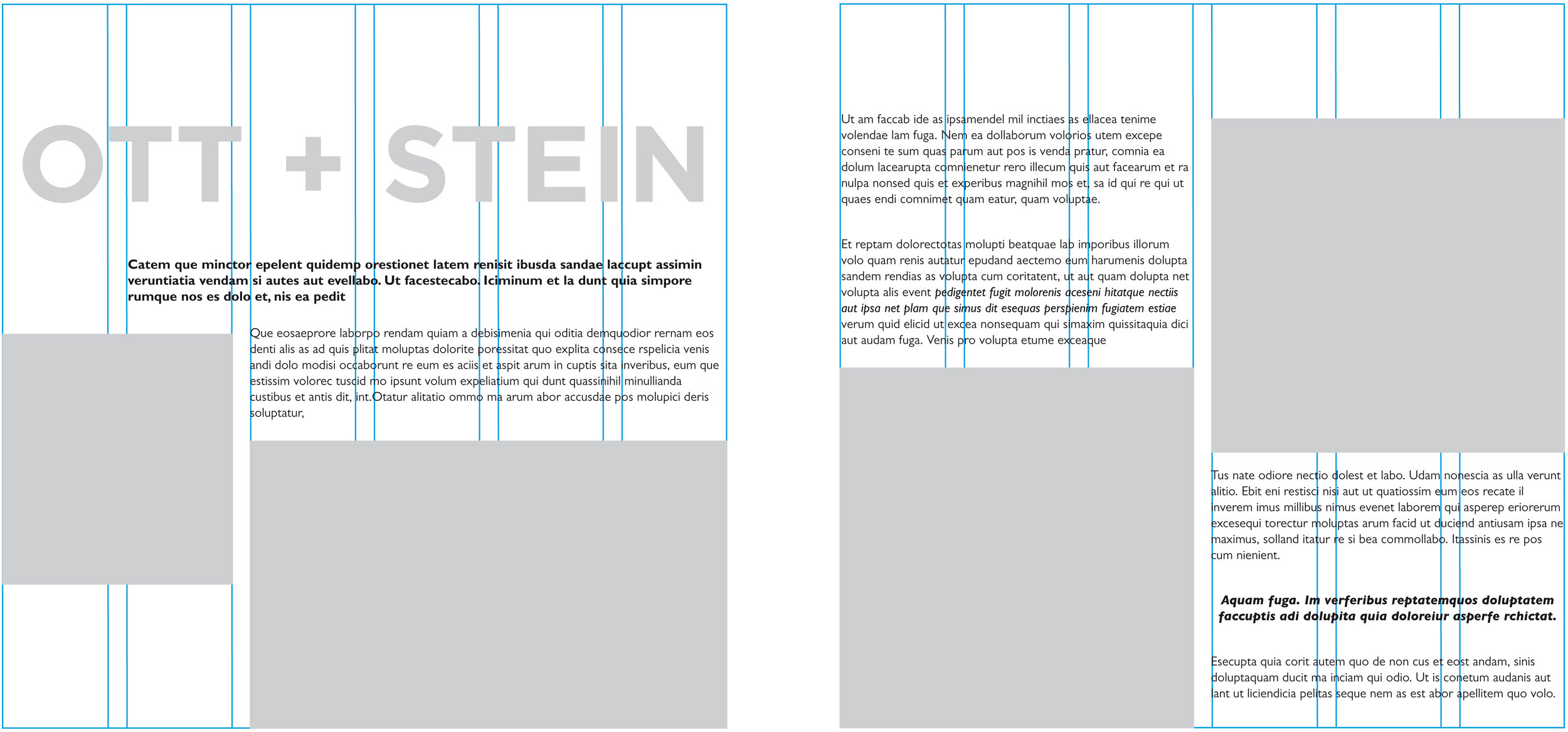
  • Create a grid - Grids are the underlying structure for your layout, regardless of the specific content that appears on each asset. Your grid template should signify the margins and help organize where objects will be placed. Here’s an example:

Source: Stephanie Pay

Source: Stephanie Pay

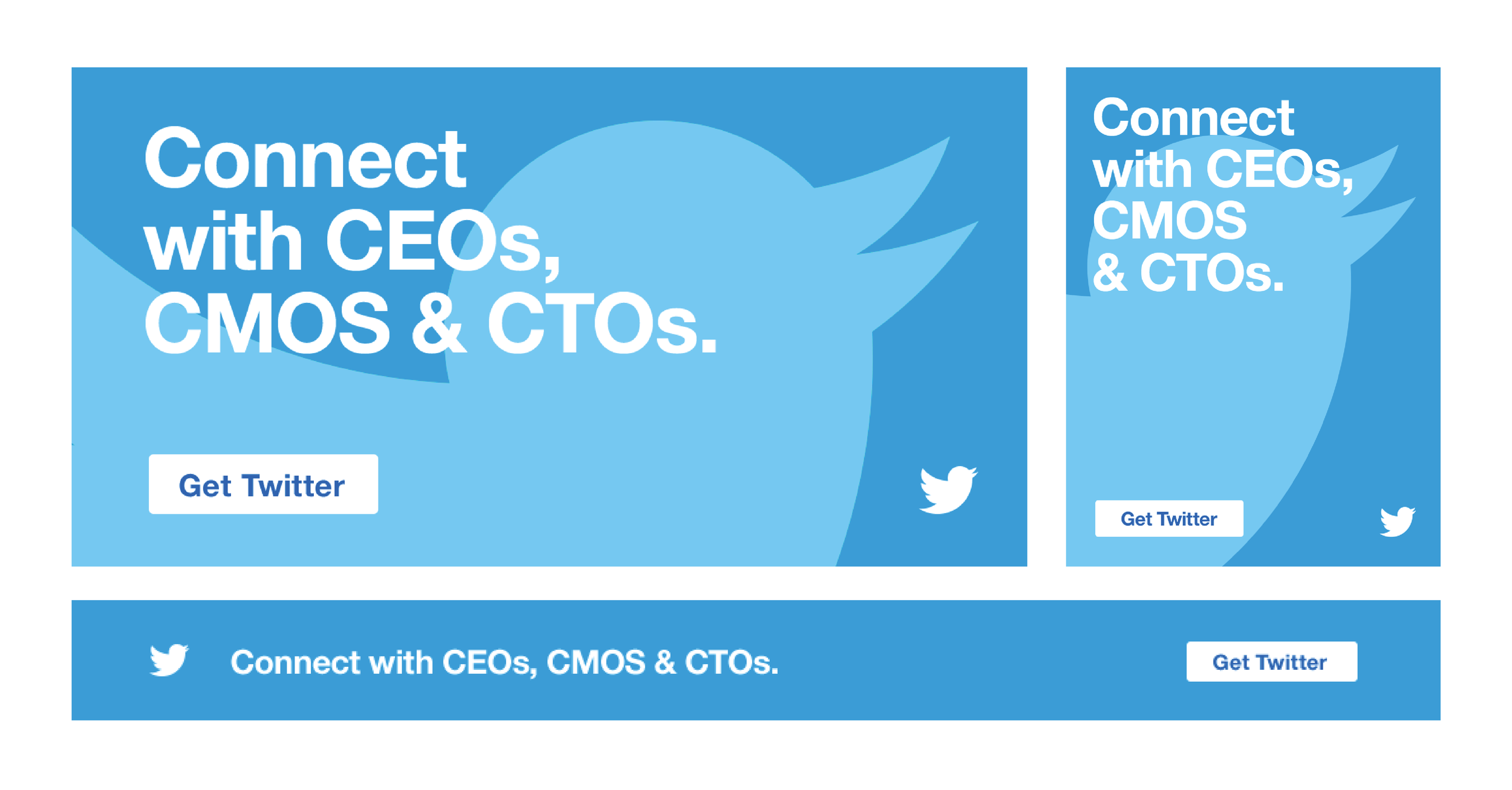
  • Create templates - Group your assets into buckets based on the type of information they contain or the layout and create a specific template for each one. For example, if you're creating ads for an ad campaign across multiple placements, create templates for portrait printed ads and landscape printed ads, portrait digital ads and landscape digital ads. If you're creating an E-commerce site, create a template for product pages and the checkout flow. Here’s an example of templates created for a digital ad campaign:

4-Essential-Graphic-Design-Project-Management-Tips-templates
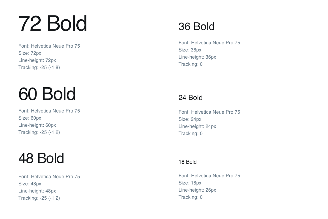
  • Design elements - Compile a collection of the different design elements you’ll be using, such as character styles, paragraph styles and color palettes.

4-Essential-Graphic-Design-Project-Management-Tips-typography-styles
  • File naming conventions - Sending the wrong files or iterations is a small mistake, but it can cause a massive headache. Detailed file names for each of your assets will help make sure that doesn’t happen. I suggest including client name, project, asset name, language, size, color space (RGB, CMYK), initials of last designed, and above all, version number. Here’s an example of a file name formula: Client-Initials_Project-Initials_Asset-Name_Language-Initials_Size_Colorspace_Version#_Designer-Initials

Templates and guidelines are helpful for establishing the rules your designs will generally stick to, but allow for some flexibility as well. Realistically, not everything will always work out perfectly, like if your copy gets too long for the standard character styles you’ve set. Specify how you’ll accommodate these exceptions — in this case, maybe type sizes can be one or two points off in order to fit all of the copy.

Project Management Tip #4: Create a Proofreading Checklist

Even if you’ve got a pair of eagle eyes, you’re bound to miss something while proofreading once in a while. One tool I’ve found to be invaluable for thorough, yet efficient, proofreading, is a checklist. This turned out to be a lifesaver a few years ago when I was helping a client with presentation prep for an upcoming conference. Putting together and printing off a quick, checkable list of the most common and easy-to-make mistakes allowed us to catch small details that might have otherwise gone unnoticed, ensuring that each presentation was polished and ready to go.

If you’re wondering what to include on your list, here are a few ideas to get you started: 

  • Are there any spelling, grammar or stylistic errors in the copy?

  • Is everything left-aligned?

  • Are all of the bullet points the same size?

  • Is the color scheme consistent throughout?

  • Are you looking at the most recent version, and is that reflected in the file name?

And remember, tunnel vision is a real thing, so you’ll benefit from having different members of the team reviewing each other's work — ideally, with multiple sets of eyes on each.

With the ever-shrinking length of the average design cycle, your team will have to work quickly to stay in your client’s good graces. But this doesn’t have to mean working round-the-clock. If you take a step back from your typical graphic design project management approach to establish your process, align all stakeholders and create guidelines for designing and proofreading, your team will be able to work smarter, not harder, to meet your deadlines.

Anastasia Salazar Ltd. is an independent design studio for tailored branding and digital designs. Reach out to learn how we can help you fuel growth and maximize your brand’s impact.

Why There Are So Few Women-Owned Design Agencies — & How We Can Fix That by Anastasia Salazar

ASL_Design-Blog-women-owned-design-agencies

While we usually use our blog to discuss branding and design, we also want this to be a space where we can address important issues facing the design community. We also believe in professing the values that are most important to our agency. On that note, I want to take some time today to talk about a topic that we here at Anastasia Salazar Ltd. are particularly passionate about: women’s representation in the design community — especially when it comes to women-owned design agencies.

As a woman-owned agency ourselves, empowering and making space for women in the creative industry is one of our highest priorities. It comes through in every aspect of our business — the team members we hire, the clients we choose, and the projects we take on. We’ve prioritized this, in large part, to help combat the gender disparity that is so prevalent in the design field.

The Harsh Reality for Women in Design

Walk into nearly any design agency, or even a company with a large in-house design team, and you’ll probably see more women than men. According to Design Census 2019, women make up 61 percent of designers in the US — but hold just 11 percent of leadership positions. But it’s not for lack of effort. For decades, women have made up the majority of college-educated adults. They ask for promotions and pay raises just as often as men. And as of January 2020, they outnumber men in the workforce.

Source: Design Census 2019

Source: Design Census 2019

So why does such a large gap remain?

It’s not just one reason — there are many different barriers to entry that women in design face when trying to start their own agency, or even climb the ladder. Some of the more common ones:

  • The pay gap: If there’s one issue in the design community that I could fix with the snap of my fingers, it would be the pay discrepancy between genders. 2018 data from the Bureau of Labor Statistics showed that women in the design field earned just 73.1 percent of what men did — and women of color tend to fare even worse.

  • The old boys’ club: When leaders or teams are composed mostly of men, it can be hard for women to relate to them. Their communication style or topics of conversation often differ, and the end result is that women don’t “fit in” the way their male counterparts do. In fact, McKinsey’s Women In The Workplace 2018 report found that 33 percent of women have never had a substantive interaction with a senior leader about their work, compared to 27 percent of men. Whether subconscious or not, this mindset frequently leads to men receiving preferential treatment and better career opportunities than women.

  • The fixation on appearance: Women in design often find themselves being judged on how they dress and present themselves — sometimes even more so than on their work. Of course, it’s fair to expect employees to maintain a basic level of professionalism and hygiene, but women’s appearance is frequently scrutinized far beyond that. Studies have consistently shown that women are perceived as less competent and less fully human when evaluators focus on the way they look.

Beyond these systematic hurdles, nearly every woman encounters instances of workplace sexism and harassment in their careers — I know I have. At one of my previous jobs, for example, I was the only woman in the room for a five-hour sales and marketing workshop. One of the exercises was a persona deep dive, where we came up with bios for different customer segments within our target audience. When we came to the persona for women 25-45, the team painted an alarmingly shallow picture: they said she’d be home in her Lulu Lemon leggings, sitting on the couch with a candle burning, drinking wine and scrolling through Bumble. Even worse, it ended with someone joking about how she would have Plan B on the table next to her. The whole room laughed except for me.

Although I’ve now re-run the situation in my head a thousand times over, thinking of all the perfect things I could’ve said, at the time I couldn’t do anything but sit in shocked silence. In an attempt to help (I guess?), one of my male colleagues mentioned a few times that they should be careful because there was a woman in the room, but the whole thing was uncomfortable and disappointing. Of course, that's just my own personal experience, but the sad truth is, many women have experienced much worse. With the odds stacked against women in design in so many ways, it’s no surprise that there aren’t more of them opening up their own agencies.

The Benefits of Equal Representation

ASL-Blog-Why-so-few-women-owned-design-agencies-representation

Okay, enough bad news — let’s talk about the amazing things that can happen when women lead design firms. Having worked with women-owned design agencies before, I can testify firsthand how powerful it is to feel represented and supported. One of my former employers was an agency headed by two women, and to this day, it’s still one of the best-run companies I’ve worked for and with. Their communication skills were on point. They would address the whole group personally when problems or tension arose, they opened the floor to feedback on a weekly basis, and they regularly held team bonding sessions. The leaders there truly put equal effort into their teams as the clients — which not many companies can claim. They showed that they really cared, but they also got business DONE.

I felt motivated and inspired working there, even if I wasn’t crazy about the specific project I was working on. Of course, that’s not to say that all of my experiences working with men have been awful and all the ones with women have been great, but throughout my career, greater diversity and equal representation have only been beneficial.

These benefits aren’t just anecdotal, though. There’s a large body of research showing concrete advantages to diversity in the workplace. A study by Boston Consulting Group, for example, found that companies with above-average diversity in their leadership teams reported innovation revenue that was 19 percentage points higher than companies with below-average leadership diversity. It makes sense — when everybody feels welcome, the room for creativity magnifies. The different perspectives that come into the fold play a key role in helping a company come up with new, cutting-edge solutions. Beyond innovation, diversity can also help companies better understand and appeal to their audience — and with women driving 70-80 percent of all consumer purchasing, through both direct purchases and influence, it’s well worth hiring women-owned design agencies who can better relate to them.

Change on the Horizon

While women in design are far from equally represented in senior leadership, partnership, and business owner positions, there is reason to be hopeful. The 3% Movement — an organization aimed at increasing the number of female creative directors — has reported that the proportion of women creative directors has increased from three percent to 29 percent in just a few years. 

Women designers are gaining more prominence in the cultural zeitgeist as well, inspiring even more women to follow in their footsteps. Contemporary women designers like Jessica Walsh, owner and Creative Director at &Walsh, have become industry celebrities, while women whose work was previously under-appreciated — such as Carolyn Davidson, the original designer of the Nike “Swoosh” logo — have finally become recognized for their significant contributions to the design world. 

There are also more organizations dedicated to celebrating and empowering women in the creative arts, such as Women in Design, Ladies, Wine & Design and Women Talk Design, dedicated events for women through organizations like AIGA, and even work spaces expressly for women and non-binary people popping up all over the world.

Source: Ladies, Wine & Design

Source: Ladies, Wine & Design

Of course, this doesn’t mean we can rest on our laurels. Women in design still have a long way to go before they reach true parity with their male counterparts, and if that’s ever going to happen, we can’t fall victim to complacency. Employers need to seek out female design talent and foster an environment in which women are able to grow and thrive by setting real, concrete, measurable goals. Members of the media and design thought leaders need to elevate the profiles of the many incredible women designers working today, as well as celebrating the achievements of women designers in the past. And companies need to prioritize working with design agencies that put their money where their mouth is when it comes to equal gender representation.

We’re committed to doing our part — and we hope you will be, too.

Anastasia Salazar Ltd. is an independent design studio for tailored branding and digital designs. Reach out to learn how we can help you fuel growth and maximize your brand’s impact.

Building an Agency from the Ground Up: Q&A From San Francisco Design Week by Anastasia Salazar

Anastasia-Salazar-Ltd-Building-an-agency-from-the-ground-up-q-&-a.jpg

Recently, my team and I were fortunate enough to celebrate our agency’s first anniversary, which was both a huge milestone and a reminder that it wasn’t so long ago that the studio was just an idea in my head. When I first started seriously looking into how to start a design agency, it all felt pretty overwhelming. Of course, I did a lot of research and worked hard, but I also received support and expert advice from a lot of people that I admired, which is why I’m so passionate about paying it forward and helping other aspiring entrepreneurs. I was thrilled to have the opportunity to speak about this very topic at San Francisco Design Week in a session called “Building an Agency From the Ground Up”.

While we already published a summary of the presentation on the blog, I also wanted to take the time to address all of the excellent questions we received at the end of the session. Here’s what attendees wanted to know, and my responses. I hope you find it helpful for your own ventures!

Q: At what point did you start hiring full-time employees vs. contract employees, and how much of your time is spent recruiting?

A: Right now, we have three full-time employees on our team: myself, another designer and a copywriter. The designer and copywriter both started out as subcontractors, but after we got into a flow and I could tell we all worked well together — about six months in — I hired them on as full-time employees.

Recruiting ebbs and flows depending on how much work we have coming in. When we get an influx of clients, we need to hire subcontractors. It takes a decent amount of time to find qualified people who are professional and a good fit — I would say about 20% of my time during those busy periods is spent recruiting. One thing I’ve done to help streamline the process is keep a running list of all the freelancers I’ve worked with in the past, so I know who to call on and how to reach them.

Q: What was the startup cost for your business? How much money should I start with or borrow from the bank?

A: The exact dollar amount is really going to fluctuate from business to business, but I recommend saving at least five months’ worth of expenses as well as any initial investments you need to make, like purchasing equipment, for that beginning period where you’re not sure how much work will be coming in. For us, it took about six months before we really found our rhythm, since we had to come up with our proposals from scratch.

Q: How did you decide between branding the business vs. being the individual name/face of the agency?

A: I decided to be the face of the company for my studio, Anastasia Salazar Ltd., because starting my agency was a direct transition from me working as a freelancer. I was also inspired by some of the designers I looked up to, like Louise Fili and Jessica Hische, who were the namesakes behind their own agencies. Note that if you’re going to name your agency after yourself, you’ll have to add an abbreviation — like Ltd. or LLC — after your name, depending on which business structure you’ve chosen.

Q: When a client asks how much something will cost and is just looking for a quick number, what do you say? Similarly, how do you negotiate with a client? 

A: Arriving at a price can be tough, because it’s always a game of “Who says the first number?” Clients don’t want to state their exact budget for fear of being overcharged, and agencies don’t want to state an exact price for fear of lowballing themselves. When I’m in this situation, I don’t give clients a straight-up cost. I tell them that we’ll send over a proposal with an estimate as well as our approach. That estimate includes a range, with a low price for the barebones essentials to a higher price for a more robust offering.

If a client comes back and says that’s still out of their budget, I usually offer a price for services with a smaller scope than they originally proposed. For example, when clients can’t afford a full brand identity designed by our team, we can offer consulting services while they design in-house. I like this strategy because it leaves room for discussion with clients who have a lower budget rather than writing them off entirely. 

Q: How do you manage long-term partnerships vs. per-project deals? Do you offer discounts for a larger contract, or something similar?

A: I’ve thought about offering discounts before, but it just always seemed a little bit too sales-y for me. Instead, what we do is keep an eye out for how we could add extra value to projects for long-term clients. For instance, we just wrapped up a project where we were initially scoped to just work on a deck, but we noticed they needed icons and photography so we offered to design an icon set and direct a photo session for them. Always keep an eye out for things your client needs, because the contacts you’re interacting with often aren’t creative professionals.

Q: How do you analyze the impact of your client project once you deliver the work?

A: It’s important to reach out to clients if you want to know the impact of your project, because you almost never have access to their data and the client is probably not going to reach out proactively with that information. What we do is check in with our clients shortly after the work is delivered: ask them how things are going, how implementation of the design went, if they have any questions — this is when you have the opportunity to ask how things are performing. Beyond that, it’s a good way to keep in touch with your clients and keep your agency top-of-mind for them.

We also pull together an internal report at the end of every project that measures things like total number of hours (billable and non-billable), how much work was done by subcontractors vs. employees, gross profit, net profit, etc. to help us determine the ROI.

Q: What makes a killer portfolio for an agency?

A: My best advice here is to highlight the work that you want to get more of. You might have done a lot of different types of projects before, but starting a design agency is the perfect opportunity to specialize in what you like best. Make sure to really show your process, too. Creatives often don’t explain their process because they assume people know what goes into it, but when a lot of your client contacts aren’t creative professionals, they won’t understand how much thought and effort it takes unless you tell them. 

For each project you feature, make sure to write a description that outlines the initial need, the solution you came up with, the thinking behind that and how you arrived at the final product. If you’re not a strong copywriter, it’s worth looking into hiring one. A poor description can negate all of the hard work that you’ve done.

Q: How did you find the correct cadence when following up with prospective clients?

A: Initially, I would reach out once, then follow up a week later and send a final follow-up the week after. That wasn’t working as well as I’d hoped, so I talked to some friends who were in sales and they encouraged me to be much more tenacious. They recommended following up two days after I sent the initial message, and then once a week after that anywhere from five to seven times, which has worked much better.

Q: How much time did it take for you to reach your minimum income goal?

A: I think the initial income goal should be your costs plus 30% (to account for taxes) and then doubled. It took us about six months to reach that.

Q: What should you include in a brief?

A: For each brief, I include:

  • Project name

  • About/background

  • Client ask/need

  • Project vision

  • Logistics (how many deliverables, and what are their specs?)

  • Budget

  • Timeline/schedule

  • Responsibilities of the team

Q: Have you ever turned a client down because they weren't a good fit, or because you could sense that they didn't value what you do?

A: Absolutely! Sometimes we get emails from people reaching out to us saying something like “We need a brand identity next week for X dollars, can you do it?” and you can tell just from that that they don’t understand how the client/agency relationship works and they won’t be a good fit. They may not even be a serious prospect, and realistically, they aren’t the people in your target audience. We also won’t take on projects where we don’t agree with what the company’s doing — we have to be aligned with their purpose for existing.

Q: What were the minimum goals for your company?

A: At first, it was just to survive. Making it to a year is a really big milestone because it's so common for agencies (and companies in general) to go under within that first year. Now, we’ve reached that goal, and we’re focused on keeping it going.

Q: What kind of client do you serve, and what kind of services do you offer? How did you come to that decision?

A: We primarily serve tech and retail because that’s what my background is in, and we’ve also gotten more into working with health clients. Our services focus on branding, partly because I have experience with it, but even more importantly, because it’s what I enjoy doing the most. Personally, I decided to prioritize that over pay. I would encourage others to do the same as well — you have to do what you love! 

Because you’re in charge, you can also expand into areas you want to do more of by hiring people who specialize in it. For example, I’m really interested in environmental design, and at some point I’d love to hire someone who has a lot of experience in that field so I can learn from them while I creatively direct them.

When figuring out how to start a design agency, it’s important to have a sense of what your niche will be. If you’re not sure, a SWOT analysis can be helpful, as can looking at what your competitors are doing to see how you’re different.

Q: How do you decide who you want to reach out to? Do you have a research process or a list of targets?

A: Fortunately, I’m at the point now where I haven’t had to do heavy outreach in a while. But when we started, we reached out to contacts based on the target audience we had identified: creative directors or chief brand officers for midsize companies in the San Francisco Bay Area. To be honest, though, I’m not sure it was very effective. I had a lot more luck reaching out to the people I’d worked with before than cold-contacting prospects. Networking face-to-face is a good option, too — you have to have some kind of connection for people to pay any attention.

I also got a lot more leads once I started investing in marketing, like SEO and our blog. The great thing about marketing is that it does so much more work than individual sales efforts. I found that the more website traffic we got, the less outreach I had to do.

Doing all of these things in conjunction will help ensure you find clients.  

Q: As a "boss lady," do you have the final say, or is it a team decision?

A: I definitely welcome collaboration, but at the end of the day, you still need a designated leader, so I do ultimately have the final say.

Q: How do you create a unique brand for your agency that sets you apart from others?

A: We found developing a brand strategy was really the key for this. In fact, we actually ended up publishing a detailed guide on how to create a brand strategy on our blog, which walks you through the process step by step.

Thank you to everyone who attended and those who asked questions on how to start a design agency — keep an eye out for a link to the full recording soon!

Anastasia Salazar Ltd. is an independent design studio for tailored branding and digital designs. Reach out to learn how we can help you fuel growth and maximize your brand’s impact.

Building an Agency from the Ground Up by Anastasia Salazar

ASL_Design-Blog-building-an-agency-from-the-ground-up_v1_Website.png

Many people looking into how to start an agency see large, established firms and think to themselves, “I could never do that.” 

But the reality is that almost all the prestigious studios we know and love started with just one or two people. They got to where they are today by taking baby steps, again and again, until they saw the right results.

Launching and sustaining a business takes a lot of patience and effort, but it’s also incredibly rewarding. I work longer hours than I did before I started my agency — even if I don’t like to admit it — but the creative freedom and sense of ownership I have in exchange is well worth it. 

Want to know how to start a branding or graphic design business? I’ve put together some tips to help you find your feet in the agency world!

Want to find out more about how Anastasia Salazar got started? Check out this five-year timeline!

How to start an agency: 9 top tips

1. Before you begin…

Business plans can encompass a lot of different things, from financial projections to organizational structure and more. Exactly which elements are necessary will vary a little bit from company to company, but I think all business plans should clearly state your services offered, target audience and mission/vision statement, with an emphasis on how you want to position the company. This plays a huge role in defining who you are as a brand and how you stand apart from the competition. It’s also helpful to address the unique skill sets your agency can offer and who you’ll do it for.

While a good business plan should be thorough and polished, you don’t need to get too hung up on perfection, especially if there are other aspects of your business that you’re anxious to work on. It’s not worth waiting years to move forward with your business just because your intro deck isn’t picture-perfect.

2. Develop your business plan

A business plan helps you understand your goals and how to achieve them. It’s also essential if you need funding from your bank or want to attract potential investors.

Business plans can encompass many different things, from financial projections to organizational structure. Exactly which elements are necessary will vary from company to company, but I think all business plans should clearly state:

  • The services you offer

  • Your target audience

  • Your mission and vision statement — how you want to position the company and what your unique selling point is 

While a good business plan should be thorough and polished, you don’t need to get too hung up on perfection, especially if there are other aspects of your business that you’re anxious to work on. 

It’s not worth waiting years to move forward with your business just because your intro deck isn’t picture-perfect.

3. Assemble your A-team

No person is an island — we all rely on others at some point or another to get by, and that’s especially true when it comes to starting your own business. 

Whether friends, family members, former coworkers or LinkedIn contacts, you likely have people in your network who are happy to lend their expertise to your new venture.

While there are tons of different fields that can be beneficial for you to learn about, I suggest you prioritize finding professionals in the legal, finance and business consulting industries. 

Reaching out to other agency founders or creative directors can be helpful too. Before I launched my business, I cold-contacted a few different creative directors I admired to get their thoughts on how to start an agency. I was pleasantly surprised with how eager they were to share their experience and advice.

4. Create a budget

82% of businesses that fail do so because of cash-flow problems. While it’s only natural that you want to spend as much money on your business to make it the best it can be, this can be a recipe for disaster.

The easiest way to keep control of your finances is to create a budget and stick to it. I’ve put together a free budget worksheet to help you determine your recurring expenses, both personal and professional.

Once you know how much your outgoings are, you can determine how much your monthly salary will be.

5. Make it official

What I found most helpful when I was preparing to open my agency was the practical, actionable advice. Getting down to basics isn’t exactly glamorous, but it will help you a lot, particularly if you’ve never started a business before. 

Requirements vary by state, but I’ve listed a few of the nitty-gritty tasks I had to complete to launch in California, as well as some links to guide you through them:

Once you tackle all of these steps, make sure to securely save all of the documentation and information associated with them. You may get asked for these documents at some point.

6. Find your clients

It’s often said that your friends and family are your first clients, and that is, for the most part, true. But you don’t have to rely on them exclusively in the early days of your business. Get your portfolio and website in top shape, then try… 

  • Uploading your contacts in a CMS: There are plenty of client management softwares, or CMSs, that are affordable for small businesses. We use Hubspot. Upload all of the relevant contacts you have, create some email templates and use them for outreach.

  • Developing a marketing strategy: One of the investments I chose to make early on was hiring a marketing strategist for a consulting project. It was money well spent — she helped me find out who my target audience was and how I could most effectively reach them.

  • Attending events & networking: My company set up shop in a women’s coworking space. It’s been a great place to connect with people, which has directly led to a few different projects for us. Find out where your audience is and go talk to them — face-to-face interactions are powerful!

  • Asking for referrals and reviews: Reach out to your former and current clients to see if they’d be comfortable leaving you a review, or even putting you in touch with organizations they know are looking for an agency. To incentivize them, you can offer referral discounts and promos.

Once you do find a potential client, try to set up an in-person or phone meeting with them to find out what they’re looking for, what their budget is and how you might be able to address their needs. 

88.jpg

7. Establish a Workflow 

Beyond deciding what you’ll do for your clients, you need to figure out how you’ll do it. I wish I’d prioritized my workflows more when starting out as it would have made my agency faster, more efficient, and much more reactive.

Here are a few things to consider when planning your workflows:

  • What will the general process look like — how many meetings, and how many rounds of feedback? What will meetings/feedback rounds entail, and how will they be held — conference call, video chat, or in person?

  • How will you communicate with clients in the interim — email, Slack, or phone?

  • How will clients pay (card, check, direct deposit, etc.) and how will you invoice them — will they pay a portion up front and the rest upon completion, or pay a weekly retainer?

    • Top tip: Holding off on giving the final files to a client until they’ve paid you in full can really speed up the payment process!

  • What exact services and deliverables will clients receive? They should never be surprised by how much you’re billing them or what they’re getting in return.

  • Will you have subcontractors, and if so, how will you manage them?

  • How will you empower clients and get them excited about your work?


As you outline this process, think about ways you can make it more efficient. For example, through email templates, platforms, a list of potential freelancers for you to call if needed, and so on.

As your agency grows, it’s important to revisit these workflows and optimize them. I did this a few years into business, and it was a total game-changer!

8. Get a feel for taxes and expenses

Finances are difficult enough, but when you become a small business owner, things get even more complex. 

Generally, it’s a good idea to work with a professional who can help you get everything in order, but it’s still valuable to understand some basic principles.

Here are a few things I’ve learned along the way:

  • Taxes change: Rather than paying once a year, those who are self-employed usually pay estimated quarterly taxes. The exact percentage you’re charged will fluctuate, but around 30% is a pretty safe bet, so make sure to account for that when budgeting and forecasting

  • Document your employees: Always have employees and subcontractors fill out a W-2 or W-4 form, depending on whether they’re part-time or full-time, and give them a 1099 form or W-9 at the end of the year

  • Log your expenses: Keep track of everything you spend, whether in a spreadsheet or accounting platform. Make sure you use tax categories so that creating profit and loss statements and filing your taxes at the end of the quarter is a cinch

Watch your spending: A lot of financial advisors will tell you that increasing your bottom line isn’t just about earning more — it’s also about spending less. Work on getting your business up and running before you think about investing in things that can wait, like full-time employees or social media management

9. Maintain Your Competitive Edge

Establishing KPIs (key performance indicators) and OKRs (objectives and key results) early on will give you a baseline to measure success and hold you accountable for continual improvement. 

If you don’t log these things in the beginning, you won’t understand what’s working and what needs to change later on. 

Here are a few things I found important to measure:

  • Revenue

  • Profit

  • Number of clients

  • Hours worked

  • Hours billed

  • Engagement on social media

You may also want to add KPIs specific to marketing, like the number of ads you created for your business and the number of leads generated through your email newsletters.

As you craft your OKRs, don’t be afraid to get ambitious — you don’t have to (and in fact probably shouldn’t) achieve all of them. The team I was on at Google aimed to achieve 70% of their OKRs — if you achieved 100%, the consensus was that you weren’t setting them high enough!

One final piece of advice about how to grow your design agency

Starting your own agency is complex and takes a lot of work. It’s understandable to feel overwhelmed or bogged down by the details, but if this happens, try to remind yourself of what you love about design in the first place. 

Go to galleries and museums, buy magazines if the cover catches your eye, look up the latest work of the designers you admire, watch and attend conferences. 

Often that can give you the motivation you need to push through. 

As someone who’s been in your shoes before, I understand what a big task you have ahead of you. However, I also know that the creative freedom, flexibility and sense of ownership you get from starting your own business makes the effort completely worth it.

Want to know more about starting an agency? Check out a recording of our webinar about how to start a graphic design business, and read the Q&A from our session

Anastasia Salazar Ltd. is an independent design studio for tailored branding and digital designs. Reach out to learn how we can help you fuel growth and maximize your brand’s impact.

5 Things Your Brand Identity Should Have by Anastasia Salazar

ASL_Design-Blog-5-things-your-brand-identity-should-have-image_Website.png

So you’ve already identified the foundational elements of your brand and brand strategy. Now, you’re ready to dive in a little deeper. If you’re hoping to create an unforgettable brand, one of the best things you can do is establish a thorough brand identity. Brand identities usually take the form of a brand book — essentially, a document that sets distinct guidelines for maintaining branding across all aspects of the business.

Brand books, also known as brand bibles, are instrumental in helping companies create and maintain a consistent message and presence — and that can pay off in a big way. Consistent branding increases revenue by an average of 33 percent, yet less than 10 percent of companies say their branding is “very consistent.” 

Staying consistent takes effort, and even more importantly, it takes guidelines. The exact information included will differ from company to company, but there are some things that all brand identities should have in common —  here are a few of the most crucial ones.

1. A Unifying Brand Identity Theme

Your brand identity may contain a lot of different parts, but it should feel like one cohesive unit. That’s why brand identities should always be built around one solid concept or vision. The unifying factor itself can be any number of things — a look, a feel, a vibe — but no matter what, it should be unique and make sense for your business.

Let's say your company offers a customized vitamin product. Maybe after digging into your values and goals, you realize that your mission is all about helping people navigate their health. You could then take this concept of navigation and incorporate it into your brand identity design, maybe by taking a common navigation symbol, like a compass, and using that as the company’s icon.

Whatever you choose as your overarching theme, the key is to make a connection with consumers so you’re able to hold a special place in their hearts and minds. 

2. Logo & Usage Guidelines

As the most critical component of your brand identity design, your logo will of course need to be included in your brand book. But this means more than just slapping your logo on a page and calling it a day. Display not only your original logo, but also all of its different color schemes (e.g. full color, grayscale) and lockups (e.g. vertical, horizontal). 

Make sure to also create rules around the usage of your logo, such as the minimum size that the logo must be for digital or print and how much clear space is required around the logo to create a buffer between it and any other content that appears alongside it. But just as important as the “dos” are the “don’ts” — for example, don’t flip the logo or alter the proportions.

ASL-Design-Blog-5-things-your-brand-identity-should-have-logo

3. Color Palette

Your brand colors will need to include more than just what appears on your logo. Yes, most brands will have one primary color, but to keep the design on your various marketing materials engaging, you should ideally include a set of secondary colors as well, including some neutrals.  

It’s important to remember, too, that not all blacks/grays/shades are the same. If you truly want to maintain consistency, include RGB (digital) and CMYK (print) breakdowns for each of your brand colors listed, as well as your hex code and an identified Pantone swatch. 

ASL-Design-Blog-5-things-your-brand-identity-should-have-color-palette

4. Typography

Typography and all of its components — typeface, kerning, hierarchy, etc. — play an important role in expressing your brand personality. Sans serif typefaces generally evoke a modern look, while serif typefaces have more of a classic feel to it. Usually, brands will include at least two typefaces in their brand books: one for headers, titles, or display typography, and another for body copy. When choosing typefaces, you’ll need to have one that either works well for web design or matches digital typefaces that are similar to your primary one.

Just as you did with your logo, you should include usage guidelines around your typography, including when and where each typeface is used — for example, is the display typography only used for headers, or can it be used in CTA buttons as well?  

YFYI_Brandbook_Select-page_mockups_v1-04.pngASL-Design-Blog-5-things-your-brand-identity-should-have-typography

5. Other Design Elements

Think of any other design elements you’ll need to use (illustration, icon sets, photography, etc.) and provide guidelines around their usage so that they complement the rest of your brand identity. Not only will this help you stay consistent — it will provide direction and clarity for any other future team members or partners that will be creating imagery featuring your brand. When in doubt, more information is better than less. Think about the specifics that you should include so that even someone that’s new to your brand can maintain consistency with what’s been done in the past.

There’s virtually no limit to the other sections you could choose to add to your brand book, such as layouts, messaging, marketing templates, co-branding and social media, to name just a few. What exactly you need to add will become apparent over time, but concrete rules around theme, logos, color, typography and other design elements will provide you with a solid foundation to build on.

And remember, your brand book doesn’t need to be set in stone! It’s a living, breathing document that can be adapted and updated as needed — just make sure to include a sign off at the beginning to keep track of how up-to-date yours is, and who’s been editing it. Refreshing your brand identity design regularly — every three to five years — will help keep your brand relevant and effective, ensuring that your brand evolves as the market does.

ASL-Design-Blog-5-things-your-brand-identity-should-have-layouts

Anastasia Salazar Ltd. is an independent design studio for tailored branding and digital designs. Reach out to learn how we can help you fuel growth and maximize your brand’s impact.

How to Create a Brand Strategy: a Step-by-Step Guide by Anastasia Salazar

ASL_Blog-How-to-create-brand-stragegy_worksheet-1-brand-graphs_v1-04.png

Coming up with a brand strategy usually isn’t the first priority for companies. More often, business leaders focus on more tangible things like business strategy, monetization and pricing. But you can’t underestimate the impact that branding has. As Paul Rand once said, “design is the silent ambassador of your brand” — and that ambassador can make or break your business. 

A brand strategy may be a little bit more ethereal than a monetization plan, but it has a number of concrete benefits. Developing one can help you discover and understand who your company is, what the public thinks about your company and how your company should evolve moving forward. When done right, it will help you differentiate your brand, communicate consistently and effectively and, attract the right customers (and even team members). If you don’t have one, however, you may struggle to describe who your company is, why your company exists, what your company believes in and what it’s trying to achieve, all of which can result in your target audience ignoring (or even disliking) your company.

To clearly articulate your brand and carve out your place in the market, the right strategy is essential. Read on to learn precisely how to create a brand strategy that will grow your business.

Branding 101

But first, before we get into the “how,” let's back up a little bit. What exactly does branding mean? Here's a great definition from an article in Entrepreneur:

"Branding is the process of forming memories, emotions and a relationship around your brand in the consumer’s brain. The goal is to build such a strong connection and such strong belief that the consumer takes on your brand identity as their own. They use your brand to help define who they are as a person."

This is a pretty lofty goal, and one that not all brands can claim to have accomplished. But the first step toward achieving this level of connection is creating a brand strategy: a plan for how your brand will complement or work in conjunction with your business strategy, usually in the form of a written document. It is the guiding force that will help you achieve concrete business goals.

How to Create a Brand Strategy 

Ready to get started? Take the following steps.

Step 1: Conduct an Audit

Before you talk about where you want your brand to go, you need to first understand where it currently is. You can do this by:

  • Reviewing existing materials: Start your audit by studying the documents you already have on hand — business plans, marketing plans, company handbooks, lists of your products/services, sales materials and proposals, a selection of branded assets and communications, pitch decks… anything that helps explain who you are as a company and what you do.

  • Conducting interviews: Don’t fall prey to tunnel vision. Your brand isn’t just about what you think, so conduct interviews with employees of all levels (and customers, if possible) to get a sense of how they perceive your brand. Go for quality over quantity, though — a handful of in-depth, high-quality conversations is better than a deluge of superficial ones that will provide you with meaningless metrics. A few prompts you could start with:

    • Give me a product overview.

    • How would you describe our brand/product/service?

    • What attracted you to the company?

    • What’s the best thing about the company?

    • What’s our biggest challenge?

  • Examining your presence: Of course, you won’t be able to speak with all of your employees and customers — so to get a better idea of what the general public thinks of you and how your brand is landing, examine all of the channels where you have a presence: web, social media, digital advertisements, print, media and the like. You may also want to ask customers or industry peers about your word-of-mouth reputation.

  • Doing a persona deep dive: You can’t effectively market yourself if you don’t understand your target audience. Start researching and brainstorming who makes up your customer base: their location, relationship status, occupation, age, hobbies, interests, bios and more. Try to get a sense of which brands they like and who they admire as well.

  • Disseminating information: Once you’ve gathered data on the topics above, organize it into a concise, but thorough, report — whether it’s a document, handbook, or presentation — and prepare to share it with your leadership team (more on that below).

Step 2: Workshop

After getting a sense of the current state of your brand, it’s time to start thinking about what the future will look like for you. This should involve:

  • Discussing with leadership: Use the report you created in the audit phase as the foundation for a conversation with your senior leadership team. Consider a fireside chat instead of a stiff, formal meeting — you might host it in a comfortable space stocked with food and beverages. After presenting your findings, open the floor for input on both the report itself and the themes explored within (internal culture, strategy, future goals, etc.) Don’t leave without a clear consensus on who the target audience is, who the competition is and how your company stacks up against them.

  • Thinking future-forward: Once all of the stakeholders are on the same page, you can start thinking about where to go next. Doing exercises will help provide some guidance. One that I recommend in particular is going through a worksheet with an assortment of scales for different brand attributes —  mechanical to human, quiet to loud, casual to formal, to name just a few — and using stickers to pinpoint where you fall on that scale now, and where you want to go in the future. Look for patterns: for example, does your whole team see your brand as safe but want it to be more adventurous?


ASL_Blog-How-to-create-brand-strategy_worksheet-brand-mapping-chart.png

Defining the core of your brand: Brand characteristics like company values and mission might seem a little bit nebulous, but defining them really can help you hone your strategy. Try to identify the following elements for your brand:

  • Purpose: Why do you exist?

  • Vision: What future do you want to help create, and what does it look like?

  • Mission: How do you create that future? What are you ultimately here to do? 

  • Values: Which principles guide your behavior? What are your value propositions?

Step 3: Create Your Brand Strategy

So you’ve taken stock of your brand and have an idea of what you want the future to look like — now, what do you do with all of that? There’s no limit to what you can create using this information, but you can start by coming up with your positioning, brand idea, brand narrative, emotional impact and messaging.

  • Positioning: Positioning is a short statement that captures the most unique aspects of your brand, why it’s relevant, what it stands for and why it matters. Effective positioning validates a concept of your brand, and ensures that it resonates with and motivates your target audience.

  • Brand Idea: Your brand idea is the sum of your philosophy — your essence and the values that inspire everything you do. It is the reason your brand exists, and it’s what drives you to deliver value to your customers every day. One great example of a brand idea is “Real Beauty” from Dove. They could have focused on the benefits of their products, but instead, Dove planted a flag in the ground that asserted that true beauty doesn't come from Dove — it comes from within. Now that’s a concept that leads to authentic, inspirational and effective marketing.

  • Brand Narrative: Your brand narrative is a manifesto summarizing who you are and what you stand for. It may go over your history or your promise to customers. Here’s an example from Cadillac:  

“We are born of ambition, optimism and a passion for what’s next. Our mission is to inspire those who don't wait for opportunities – they make them. Those who do not long for success – they create it.

The restless, undaunted, driven few who achieved greatness through guts, grit and determination. The ones who, powered by sheer force of will, go through obstacles, not around them, the ones who navigate the unknown with the fearlessness and unwavering belief in themselves, who wear their swagger like armor and live for the fight.

These extraordinary people inspire us as well – inspire us to create an icon, change the game and raise the bar and then raise it higher still, because we believe you don't wish or hope your way to what's next. You make your way.”

  • Messaging: A messaging document can be an entire project in itself, but make sure to at lease cover the basics:

    • Voice: How do you sound, and how don’t you sound? What adjectives would you use to describe the way your brand communicates with your audience, both spoken and written?

    • Tone: What attitude do you have? Are you a mysterious stranger, for example, or a golden retriever? 

    • Tagline: Your tagline is a sentence, phrase, or word used to summarize a market position in a memorable way. Think: "The best or nothing" for Mercedes, or "The milk chocolate melts in your mouth, not in your hand" for M&Ms.

    • Messaging Pillars: Your messaging pillars are the key stories you want to tell about your brand. They should emphasize what makes you unique and different from any other company. Every piece of content you create should reinforce these core messages across all touchpoints.

    • Elevator Pitch: How would you sell someone on or inform them about your brand if you could only do so in the course of one elevator trip (roughly 10 seconds)?

  • Emotional Impact: How do you want your brand to make people feel — which emotions would you ideally like to evoke?


*Tip: It’s helpful to create an overview document or page that has your vision, pulled from your business strategy, positioning, brand idea, emotional impact and finally creative considerations or how the emotional impact will be executed through vi…

*Tip: It’s helpful to create an overview document or page that has your vision, pulled from your business strategy, positioning, brand idea, emotional impact and finally creative considerations or how the emotional impact will be executed through visuals/creative.


Step 4: Execute

After all of the legwork comes the fun part: execution! Now, you get to bring your brand strategy to life through visual assets to be used anywhere your brand appears. Of course, each company will do so in their own unique way, but thinking about a few common elements will help you figure out how to best accomplish this — more on that to come in our next blog post!

Anastasia Salazar Ltd. is an independent design studio for tailored branding and digital designs. Reach out to learn how we can help you fuel growth and maximize your brand’s impact.

5 Great Brand Identity Examples (& Why We Love Them!) by Anastasia Salazar

ASL_Blog-Post_5-great-brand-identities-and-why_V1-01.png

In the design world, it’s easy to get intimidated by the big guys. Companies like Nike and Apple are just a couple of iconic brand identity examples that are recognizable worldwide, with sharp, consistent looks across every medium. “How am I supposed to compete with that,” you might think. Often, this kind of mindset results in a creative block.

But at times like these, one of the best ways to move forward is by stepping back. When it comes to looking at other brands, choose to be inspired instead of envious — with so many companies, agencies, and individuals designing incredible work, you’re doing yourself a disservice if you don’t seek it out. Of course, you don't want your brand to look like the clone of another, but surveying the landscape can play a key role in informing your own brand identity and strategy.
There’s no shortage of impressive brand identities out there, but for this post, I compiled a few favorites across a range of styles and industries so you can sample a little bit of everything. Look through them below, making sure to take note of what you like, what you dislike, and how those takeaways can be applied to your own brand identity design.

Top Brand Identity Examples

NASA

While NASA’s brand book, pictured above, was created in 1975, designers Richard Danne and Bruce Blackburn managed to create an enduring look that still holds up well today. Even the packaging of the book is amazing. I love the space-age metallic pouch it comes in, and the black texture on it that gives off a cool, retro, Xeroxed feel. Their logo, meanwhile, is a real testament to timeless design — while it did change in the 90s, NASA recently announced that they’re going to revive the old logo for use on a space shuttle called Falcon 9.

The content of the book itself is just as solid as the logo. I love how their brand identity reads almost like a textbook — it does a great job conveying NASA’s scientific, intellectual vibe, which helps to emphasize their credibility and expertise. The print medium sets it apart as well, with so many other companies today opting for digital brand books. It’s so thorough, too. Every use case down to the “confidential” stamp is included. (On a side note, how badly do you want their clothing? I would totally buy their flight jacket!)

Overall, I consider it the standard to which all other brand books should be held.

Fort Point Beer Company

Shoutout to SF-based agency Manual — this group does super cool work, including the brand identity design for Fort Point Beer. As an SF native, I often cringe when companies try to capitalize on San Francisco-related imagery in an attempt to look “authentic,” but Fort Point succeeded in creating a tribute to the city rather than just trying to profit off of it. Anyone can slap an icon of the Golden Gate Bridge on their product, but many of the landmarks that appear on Fort Point’s products — like the Dutch windmill in Golden Gate Park, or the Bay’s ever-present cargo ships — are references that only locals can recognize.
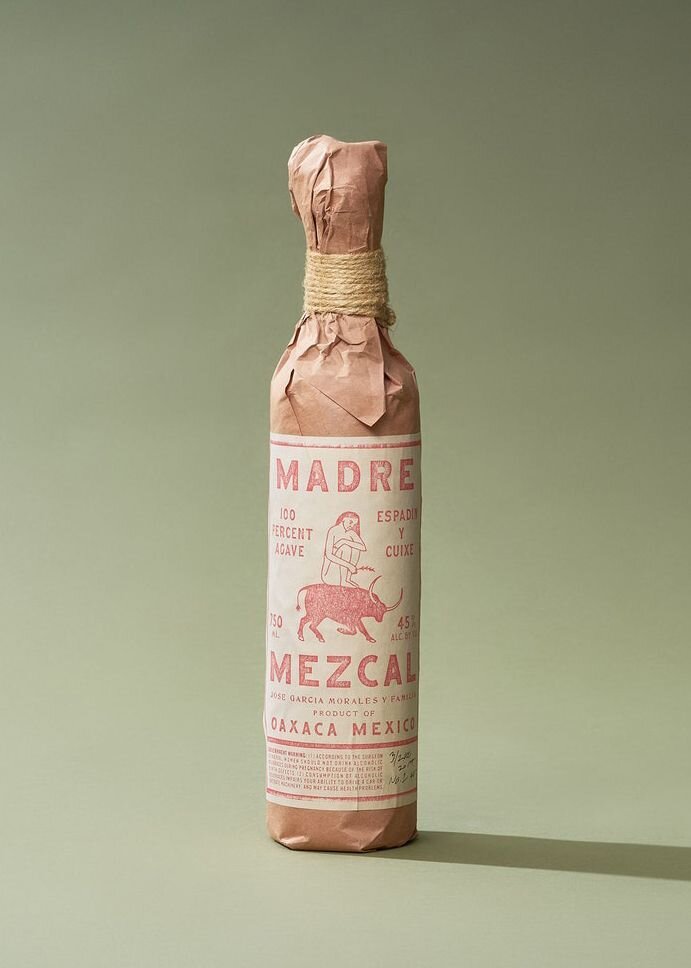
Speaking of which, the geometric, single-weight illustrations really work for Fort Point. Although it’s a very trendy aesthetic right now, Manual was able to put a unique spin on it that Fort Point could own. The monochrome photos look great, too. Each of the different elements present complement one another to create a cohesive visual system that's contemporary, authentic, and meaningful.

Allbirds

With the Allbirds brand identity, design and marketing agency Red Antler completely nailed the look that most of today’s direct-to-consumer brands are going for: clean and bright minimalist photography, playful illustrations, and geometric color blocking. In fact, in the 4+ years since the brand identity launched, it’s become so popular that many other brands have tried to pull it off themselves — although no one has ever quite been able to measure up to the original, in my opinion.

One of the best things about Allbirds’ original design is that it left room for branding evolution and growth. Now that Allbirds is a well-established, widely-recognized brand, they’ve begun to take some more creative risks. Increasingly, the photography featured on Allbirds’ site is expanding beyond its original immaculate, highly-manicured format to show unexpected details and textures, like the dirt sprinkled on the background of a recent homepage header (see below). The company has also begun to embrace more natural colors instead of the strictly pastel palette they started out with. Throughout all of the change, though, Allbirds has always been able to remain true to their brand.

Seed

I’m calling it right now: Seed, a woman-run microbiome product company, is going to be a branding trendsetter. Designer Jam Sayne has created a brand identity design that really leans into the company’s grounding in science and research. The visual style strikes a perfect balance between a cutting-edge look and an organic, natural feel. The clean, straightforward sans-serif text of the website is complemented by artful, almost floral, images of bacteria blooming in petri dishes. Even the UI is inspired, with your icon serving as a magnifying glass as you hover over text and images.

Usually, design agencies specialize in either digital or print, but the team behind Seed’s brand excelled at both here. The packaging is simple to the point where it’s almost anti-design, but the dead-on execution of the fine details — color, font, icon — make it masterful. 

Madre Mezcal

Madre Mezcal is one company that has put art and tradition at the front and center of their brand identity. Initially, I wasn’t sure how I felt about an agency run by two white guys using a traditional Oaxacan aesthetic, but I have to hand it to them — they really paid their dues to understand the craft of mezcal making. 

On the website for the agency, Land, the Madre Mezcal case study shows the lengths they went to in order to honor the culture. Photos — both in color and black and white — of agave plants, workers, and daily life in Mexico drive home the rugged authenticity of this family-owned company operating out of Oaxaca, while vintage packaging details like the image of a woman riding a bull, faded print, and paper and twine wrapping bring to mind the rich history of traditional mezcal making.

It goes to show that companies don’t need to jump on the bandwagon of computer-forward design, sans serif fonts, and vector illustrations — embracing your roots can be even more powerful. The end result isn’t just pretty graphics, but rather, a brand identity that pushes the boundaries of how we define contemporary design.

While the five brand identity examples above are among my recent favorites, the amount of incredible design being produced today is nearly endless — so keep researching until you find a style that speaks to you!

Anastasia Salazar Ltd. is an independent design studio for tailored branding and digital designs. Reach out to learn how we can help you fuel growth and maximize your brand’s impact.