
Brat album cover: Missed opportunity or anti-design masterpiece?
It’s not every day that an artist releases a record whose artwork gets imitated by the Sims, Gucci, and the UK’s Green Party.
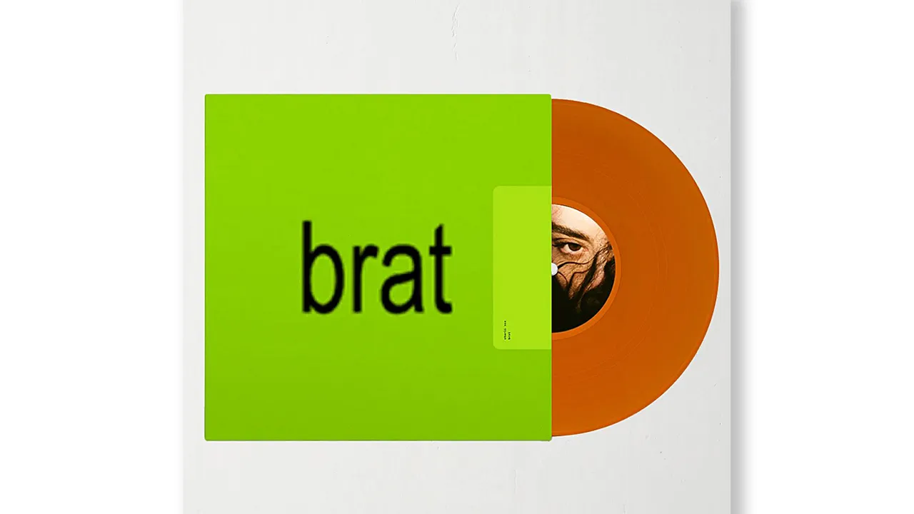
But that’s precisely what happened when Charli XCX released her sixth album, “Brat” in June. Even if you’ve got no idea who Charli XCX is, you might recognize the slime green color, distorted font, and minimalist design.
Her fans were upset when the album was released – unlike her previous albums, she wasn’t featured on the cover.
(Charli XCX responded by saying the demand for women to be seen on album artwork was “misogynistic and boring.”)
From a design perspective, we find the discourse around the album fascinating. While Charli XCX isn’t the first artist to go down the minimal album cover route, it’s interesting to see so many people take the artwork to heart.
But what makes the Brat album cover so good? Let’s break it down.
The color
You know your branding is on point when your customers can recognize you from one color alone. Think the robin’s egg blue of Tiffany & Co, the Hermès orange, or the Millennial pink of Glossier.
It took these brands years, even decades, to reach that stage, but Charli XCX achieved it with one album cover. Pantone would’ve been smart to make it the 2024 Color of the Year.
Okay, the Brat color (#8BCF00 if you’re interested) isn’t one that everyone wants to claim. It’s grungy, grotesque and looks slightly biohazardous. It reminds us of the slime they used on Nickelodeon, or the top of a Maybelline Great Lash Mascara, or Chumbawamba’s album ‘Tubthumper’ from 2006.
Charli XCX said this was intentional… “I wanted to go with an offensive off-trend shade of green to trigger the idea of something being wrong.”
Brent David Freaney of Special Offer (the creative studio that designed the cover) followed this up with “Charli had a very clear idea of what she wanted from the jump… we went through hundreds of pairings of type and color and … ultimately chose a green that felt very off-trend. Something that didn’t ooze ‘taste’.”
Discomfort has always been a tool in modern art and design – it evokes emotion and encourages people to think beyond the standard norms. Think of Marina Abramovic, who encouraged audience members to use items on her, from feathers to knives.
The best art is always divisive – if everyone likes it, is it really art?
The typeface

Low-res, blurred, and distorted, the Brat type doesn’t seem to be an exercise in skilled, precise typography. However, like the puke green color of the album cover, appearances can be deceptive.
Special Offer has gone on record to say that the font on the Brat cover is a customized version of ABC Rom designed by Dinamo. However, they also used Arial in some instances, for example, in stage graphics.
According to the blurb: ABC Rom “combines the rationalized lines of (Grotesk typeface styles) with raw details from (Gothic typeface styles), resulting in moments both beautiful and dissonant.”
Beautiful and dissonant – two extremes combined in one font. The right typography for an album cover created to inspire debate.
(By the way, if you want to create your own wording in the Brat style, this website has you covered.)
Anti-branding and how it’s making a comeback
We talked about “anti-branding” being a major design trend all the way back in 2023, and we’re pleased to mark it off our bingo card!
Anti-branding is all about understanding the rules and throwing them out the window. When you know what works, you can get experimental with colors, shapes, and typography.
As legendary director John Waters once said: “To understand bad taste, one must have very good taste.”
Another thing to remember is that art is cyclical – past trends reemerge and disappear. Charli XCX’s cover art is reminiscent of the artwork of the late 90s. Textured, raw, disruptive.
The thing we like most about the Brat cover? It’s authentic. From the interviews surrounding the cover art, it’s evident that Charli XCX wants to step back from the fakery of the music scene and present a more genuine image.
In her own words: “I’d like for us to question our expectations of pop culture. Why are some things considered good and acceptable, and some things deemed bad?”
Over to you – what do you think of the Brat album cover? Stroke of genius, or do you prefer your album covers to be more traditional?
A roundup of our favorite brat memes


Anastasia Salazar Ltd. is an independent design studio for tailored branding and digital designs. Reach out to learn how we can help you fuel growth and maximize your brand’s impact.