Google Play: Brand Identity Guidelines & Environmental Design
With Google Play gift cards sold in over 800K stores around the world and reaching more than $3.34B in sales in 2018 alone, it’s safe to say that the product is a hit.
With such rapid growth, though, it’s often challenging for brands to maintain their feel. We worked alongside Google Play on an extensive project that involved laying out precise editorial and visual guidelines as well as developing new creative content (video, marketing templates, and environmental design) to strengthen their retail presence — all the while leveraging Google Play’s extensive data and analytics as well as our own custom research studies.
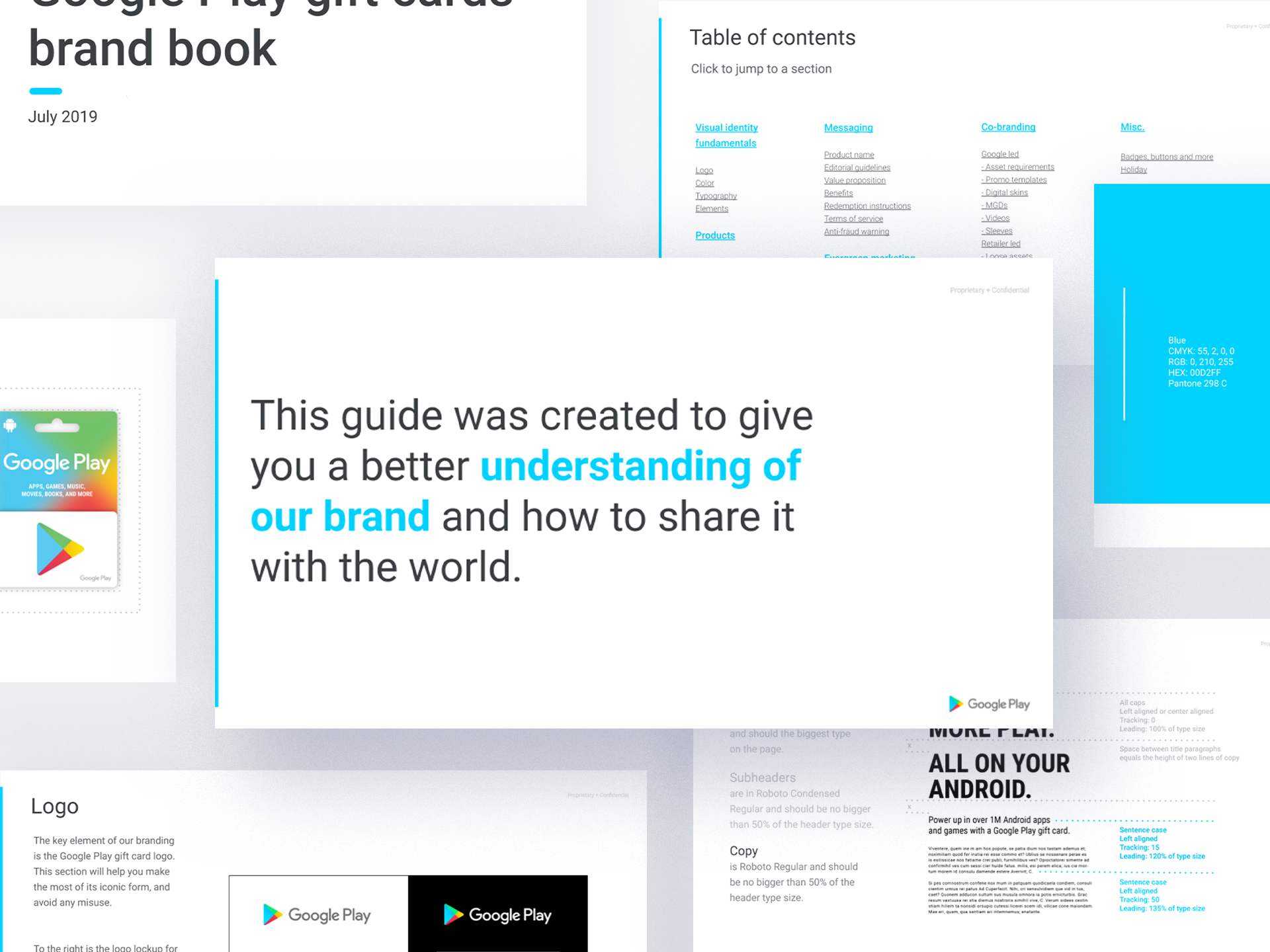
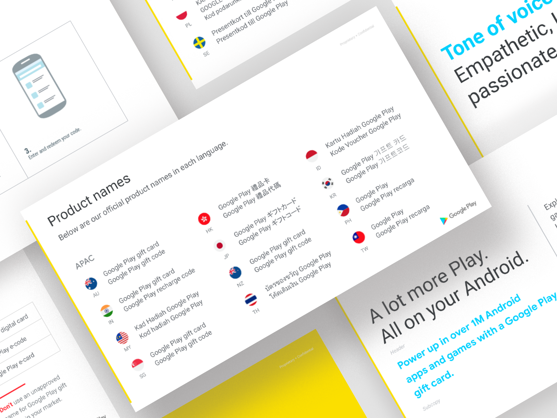
We started by repositioning Google Play gift cards through a brand book that detailed the visual style and language that should be used.
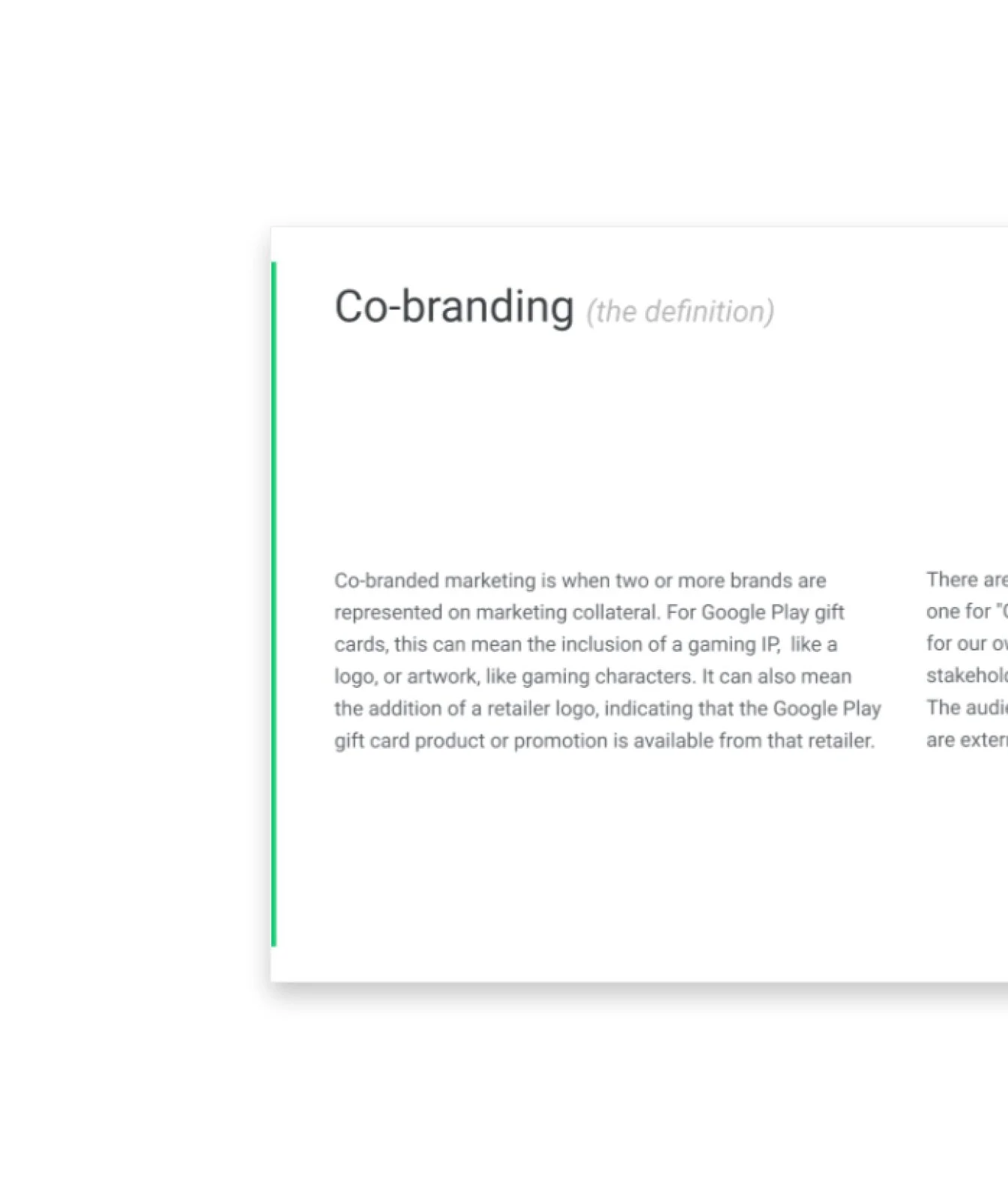
We also helped streamline the partnership process by creating clear guidelines for collaborations. From a creative perspective, all partnership promotions have to be co-branded to represent both brands, all the while being aesthetically pleasing and easily scalable.
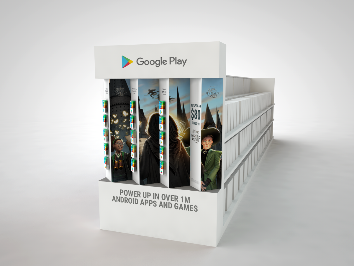
To address this challenge, we created a retail fixture display that featured two brands at once, where the viewer’s perception changed with their angle of approach — constructing a continual experience as they walked down the aisle.
In addition, we provided art direction and storyboarding for videos featured in-store that highlighted Google Play game footage.


