

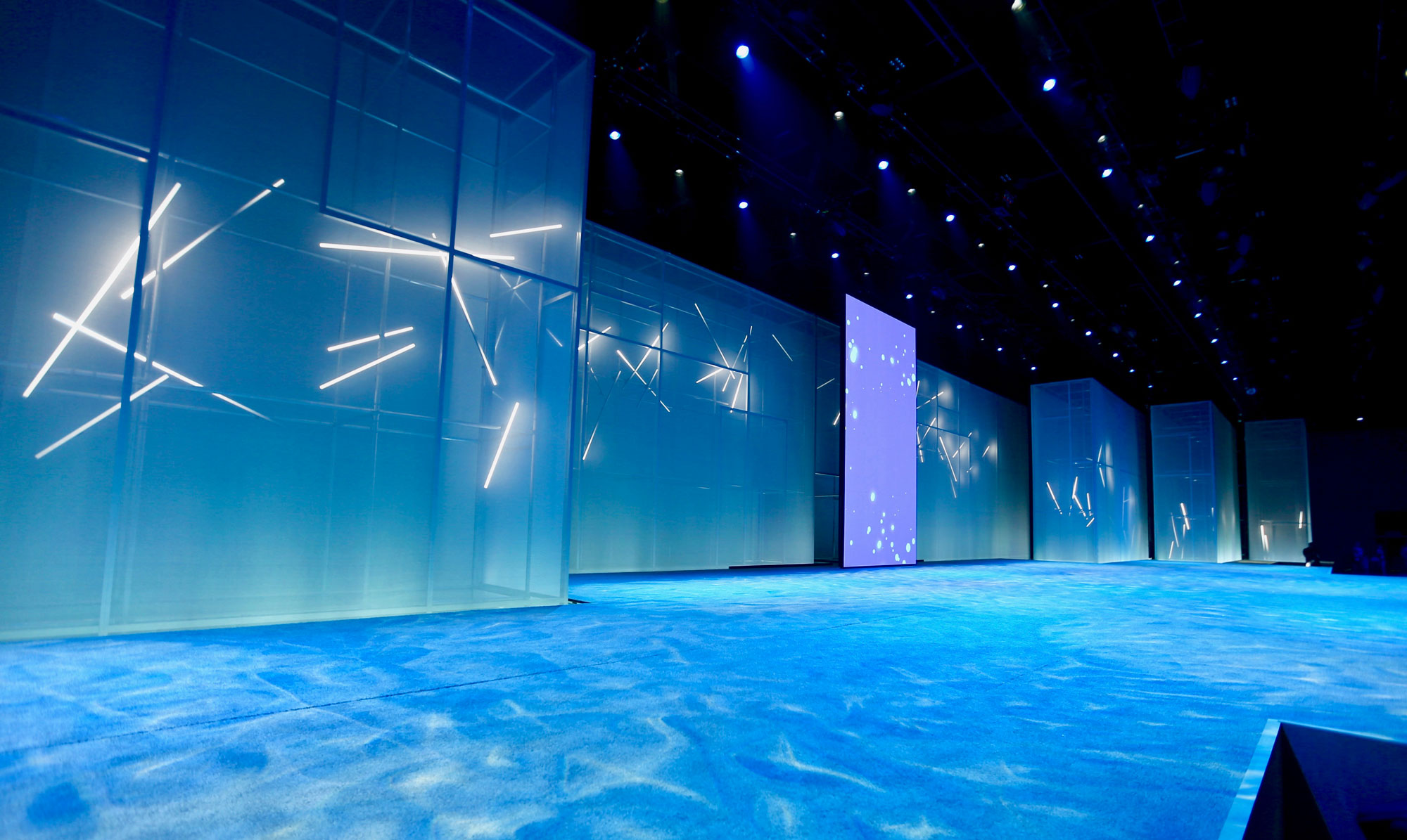


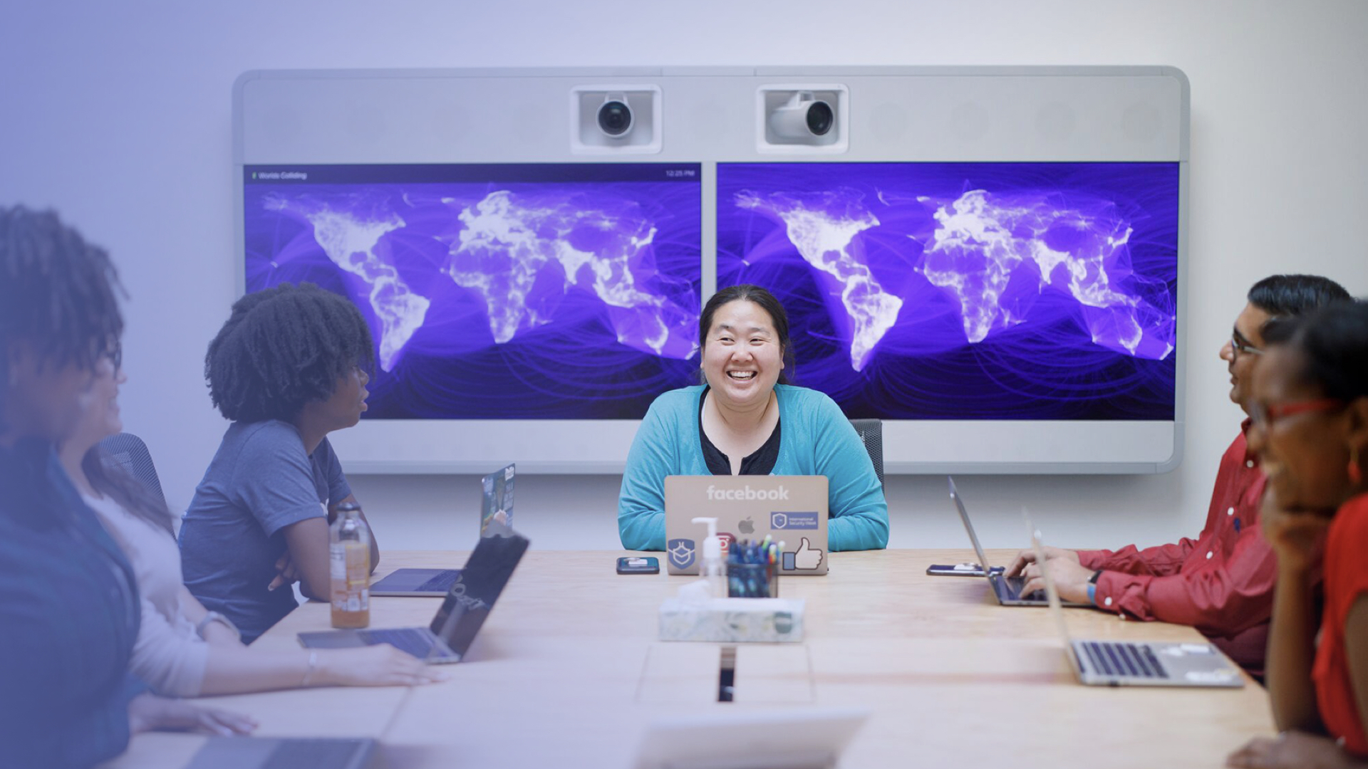
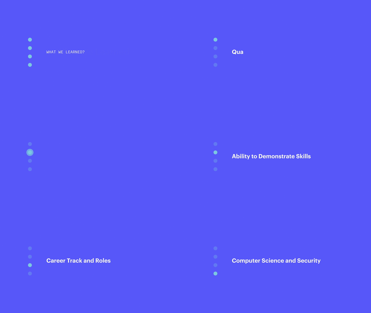


For Facebook’s annual conference, F8, we chose to make community — one of the company’s core values — the center of our design concept. To accomplish this, we closely collaborated with Facebook’s internal public relations and creative teams, as well as external vendors, to craft a visual story that accurately reflected the brand and conference.
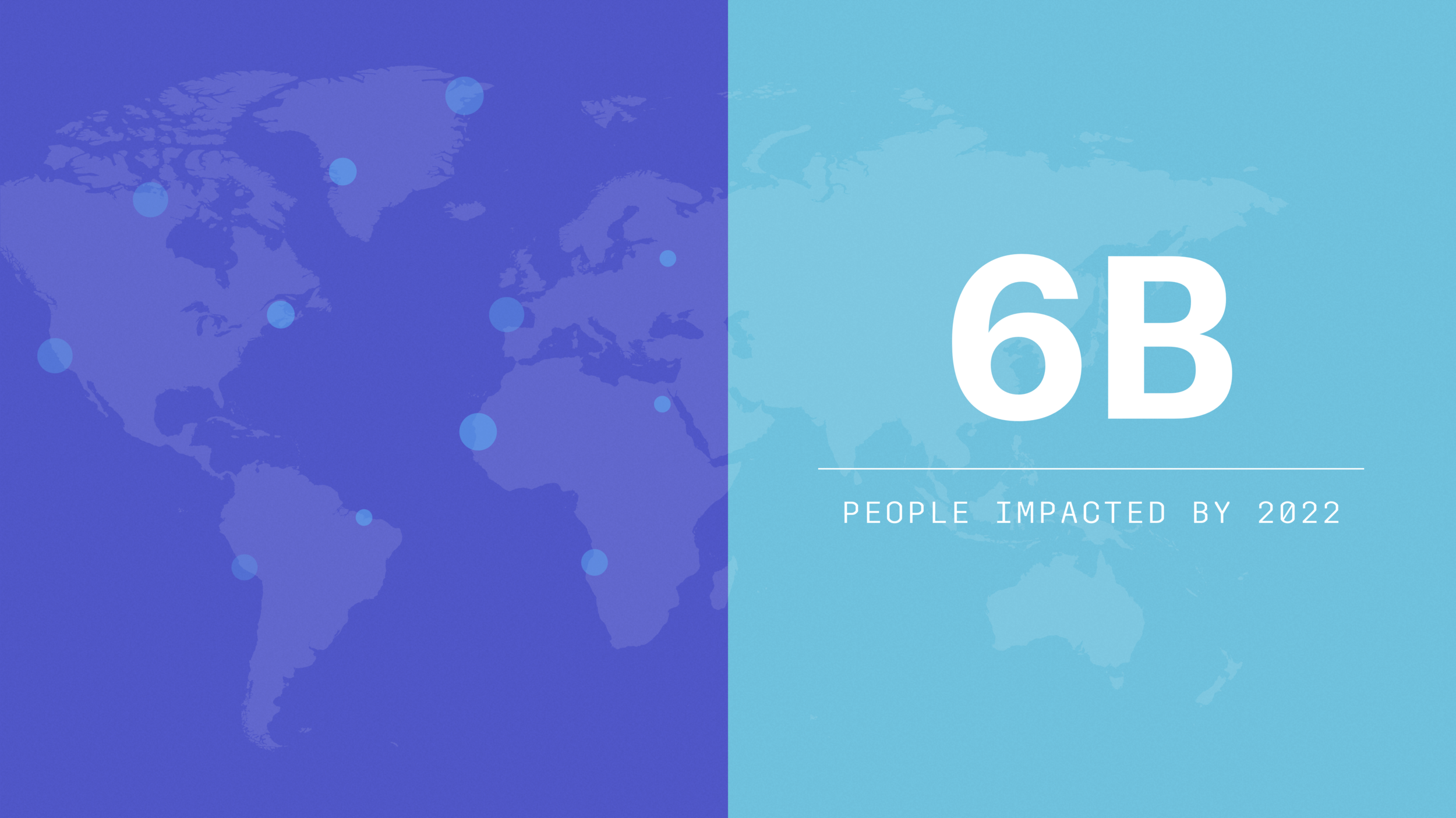
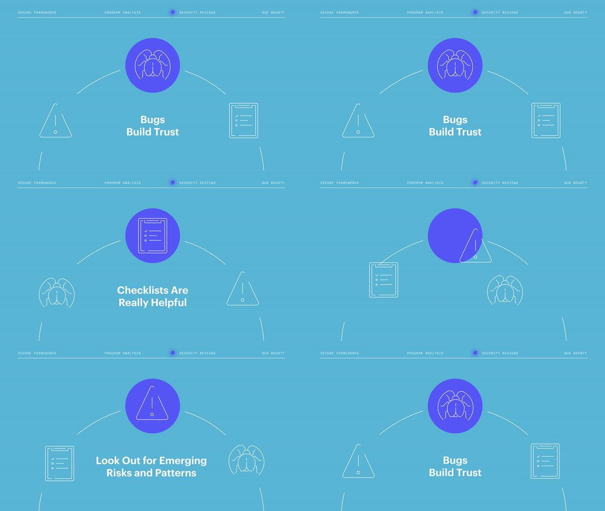
We ended up creating a vibrant, dynamic visual system that used orbs, patterns, and motion graphics to conjure the image of community members coming together — a design that could be consistently applied across different materials, but was still flexible enough to be tailored to each individual use. One area of focus for us in particular was presentation preparation. Not only did we customize the template deck for speakers and their respective content (as seen above); we helped them distill complex information on highly technical subjects into smooth-flowing stories through succinct bullet points, personal anecdotes, and eye-catching visual aids.
The end result was an event with polished, cohesive visuals that supported the brand and company values as well as a series of valuable, seamless presentations that informed and engaged audience members.
May 2018
Role: Art direction, storyboarding, presentation design, iconography, artwork, concept development, and content development
